Checkbox List with custom options
The Checkbox list with custom options type allows to creation of multi-selection checkmark elements.
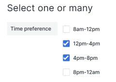
Specific for this element are the following options:
- User options.
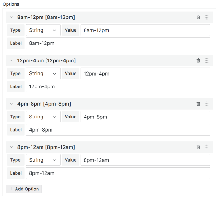
To add an option click the 'Add option' button and then specify an option type (number or string), value, and label.
Change Elements Model
Use this model to set element(s) if you use context.panel.onChangeElements([]) method.
Dynamic element creation and manipulation through the panel uses the concept that the model of the element(s) will be fetched in its entirety and set through a method. The elements will not be saved in the panel options.
{
  uid:'',
  id: '',
  title: '',
  type: 'checkboxList',
  labelWidth: 10,
  width: 30,
  tooltip: '',
  section: '',
  unit: '',
  value: [],
  disabled: false,
  background: '',
  labelBackground:'',
  labelColor: '',
  optionsSource:'Custom',
  helpers: {
    showIf: () => true,
    disableIf: () => false,
    getOptions: () => [],
  }
}
Code example
/**
 * Element example
 */
const element = {
  uid: "uid-123",
  id: "id-123",
  title: "Element",
  type: "checkboxList",
  labelWidth: 15,
  width: 30,
  tooltip: "",
  section: "",
  unit: "",
  value: [],
  background: "",
  labelBackground: "",
  optionsSource: "Custom",
  labelColor: "",
  helpers: {
    showIf: () => true,
    disableIf: () => false,
    getOptions: () => [
      { label: "1", value: 1 },
      { label: "2", value: 2 },
    ],
  },
};

const elementsForUI = [];
elementsForUI.push(element);

context.panel.onChangeElements(elementsForUI);
Code Example with Query action for Initial Request
/**
 * Convert JSON to form elements array
 */
const formElements = JSON.parse(
  context.panel.data.series[0].fields[0].values[0]
);
/**
 * Set elements with helpers
 */
context.panel.onChangeElements(
  formElements.map((element) => {
    const elementInForm = context.panel.elements.find(
      (item) => item.uid === element.uid
    );
    let value = element.value;

    if (element.uid === "comment" && elementInForm) {
      value = elementInForm.value;
    }

    return {
      ...element,
      value,
      helpers: {
        showIf: () => true,
        disableIf: () => false,
        getOptions: () => element.options,
      },
    };
  })
);
Element Parameters
-
valueArray. Optional.
Current element value. -
typestring. Required.
Element type: 'checkboxList'. -
optionsSourcestring. Required.
Element options source: 'Query' | 'Custom' | 'Code'.
-
uidstring. Required.
Unique identifier is used for correct mapping on UI. -
idstring. Required.
Unique identifier of element. -
titlestring. Required.
Title/Label of element. Equivalent to the 'Label' in the UI editor.
-
labelWidthNumber | null . Required.
Element label width. -
widthNumber | null. Required.
Element width. -
tooltipstring. Required.
Element tooltip. Leave empty string ('') if not displayed -
sectionstring. Required.
Unique section identifier (section ID). Specified if the element is placed in a section. Leave empty string ('') if the element has no section. -
unitstring. Required.
Units of measurement. Located to the right of the element. Leave empty string ('') if has no unit.

-
backgroundstring. Optional.
Hex color code. Background color. -
labelBackgroundstring. Optional. Hex color code. Label Background color.
-
labelColorstring. Optional.
Hex color code. Label color. -
helpersHelpers - provide information about the item display or its disable state, returns options
 {
  showIf: () => true,
  disableIf: () => false,
  getOptions: () => options || [],
 }
-
helpers.showIfFunction. Required. Should return true or false. Responsible for displaying the element on the UI.
-
helpers.disableIfFunction. Required. Should return true or false. Responsible for disable state the element on the UI.
-
helpers.getOptionsFunction. Required. Should return array of options.
Each option contain following property
-
value.
string. Required. Option value -
label.
string. Required. Option label
-
Change Options Model
Use this model to set element(s) if you use context.panel.onOptionsChange({}) method.
The element added through this method will be added to the panel options. Operation of the element may not be the same as the expected behavior.
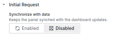
If you use it in the initial request, don't forget to disable the Synchronize option.
Enabling the Synchronize option and using it together with context.panel.onOptionsChange() in the Initial Request will cause the panel to reload constantly.
{
  uid:'',
  id: '',
  title: '',
  type: 'string',
  labelWidth: 10,
  width: 30,
  tooltip: '',
  section: '',
  unit: '',
  value: [],
  showIf: '',
  disableIf: '',
  fieldName: '',
  queryField: {},
  optionsSource: '',
  queryOptions: {},
  options: [],
  getOptions: '',
  background: '',
  labelBackground:'',
  labelColor: '',
  hidden: false,
}
Code example
context.panel.onOptionsChange({
  ...context.panel.options,
  elements: context.panel.options.elements.map((element) => {
    return element.id === "name" ? { ...element, value: "test" } : element;
  }),
});
const formElements = JSON.parse(
  context.panel.data.series[0].fields[0].values[0]
);

context.panel.onOptionsChange({
  ...context.panel.options,
  elements: formElements,
});
-
valueArray. Optional.
Current element value. -
typestring. Required.
Element type: 'checkboxList'. -
optionsSourcestring. Required.
Element options source: 'Query' | 'Custom' | 'Code'.
-
uidstring. Required.
Unique identifier is used for correct mapping on UI. -
idstring. Required.
Unique identifier of element. -
titlestring. Required.
Title/Label of element. Equivalent to the 'Label' in the UI editor.Label field -
labelWidthNumber | null . Required.
Element label width. -
widthNumber | null. Required.
Element width. -
tooltipstring. Required.
Element tooltip. Leave empty string ('') if not displayed -
sectionstring. Required.
Unique section identifier (section ID). Specified if the element is placed in a section. Leave empty string ('') if the element has no section. -
unitstring. Required.
Units of measurement. Located to the right of the element. Leave empty string ('') if has no unit.Unit of measurement -
backgroundstring. Optional.
Hex color code. Background color. -
labelBackgroundstring. Optional.
Hex color code. Label Background color. -
labelColorstring. Optional.
Hex color code. Label color. -
showIfstring. Optional.
"Show if" function of the element returns the value true or false. Responsible for displaying the element on the UI.{
showIf: "if (condition) {\n return true\n}\n return false";
} -
disableIfstring. Optional.
"Disable if" function of the element returns the value true or false. Responsible for disable state the element on the UI.{
disableIf: "if (condition) {\n return true\n}\n return false";
} -
fieldNamestring. Optional.
Name field from DataSource initial request. Use for initial value. Rec. usevalueinstead it. -
queryFieldobject. Optional.
Name query from Query initial request. Use for initial value. Rec. usevalueinstead it.Parameters:
-
refId
string. Frame refId -
value
string. Field name -
label
string. Format:refId:value(A:time)
-
-
getOptionsstring. Optional.
"getOptions" function of the element returns options for list. Use foroptionsSource: 'Code'.{
getOptions: "return [{value:1,label:'1'}]";
} -
queryOptionsobject. Optional.
Return options from query. Use foroptionsSource: 'Query'.Parameters:
-
source
string. Frame refId -
value
string. Field name -
label
string. Field name
-
-
optionsarray. Optional.
Return options for checkbox list.Each option contain following property
-
value.
String. Required. Option value -
label.
String. Required. Option label
-