Form Elements

The Business Forms plugin is equipped with a rich variety of element types to cover almost any imaginable requirements of a web application.

Layout

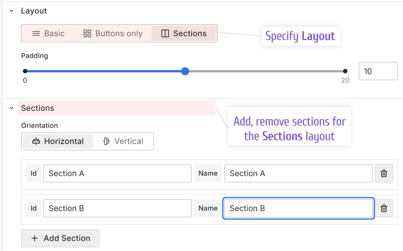
You have a choice of three layouts - Basic, standard Buttons Only, and Sections. To switch between them open the Layout category.
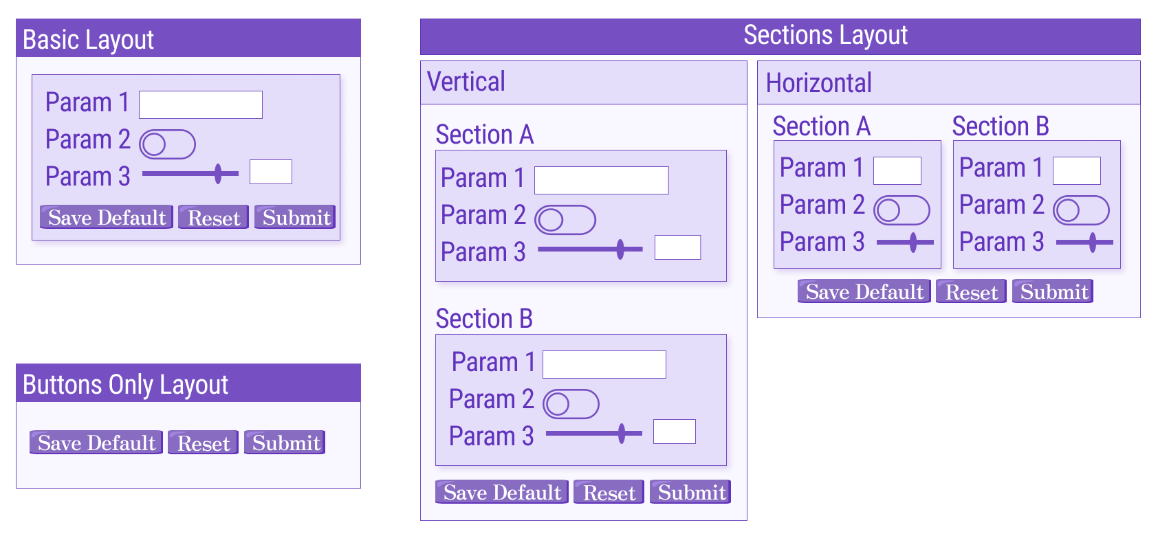
Layout can be Basic, Buttons Only, and Sections.
Form elements layout types.

Basic

In the Basic layout, all form elements are positioned vertically, one following another.

Sections

With the Sections layout, you can create as many sections as needed and place sections either vertically or horizontally using the Orientation option.

As shown in the picture above, when the layout Sections is chosen, the controls to create sections appear. For every section you can specify an ID, to use for referencing later, and a name which will be a displayed as a section label.

Version

The Collapsable parameter has been supported starting from version 4.0.0.

Sections can be collapsible. This functionality is available only for the sections in the Vertical orientation. You can make any section Expanded for the form opening/refresh.
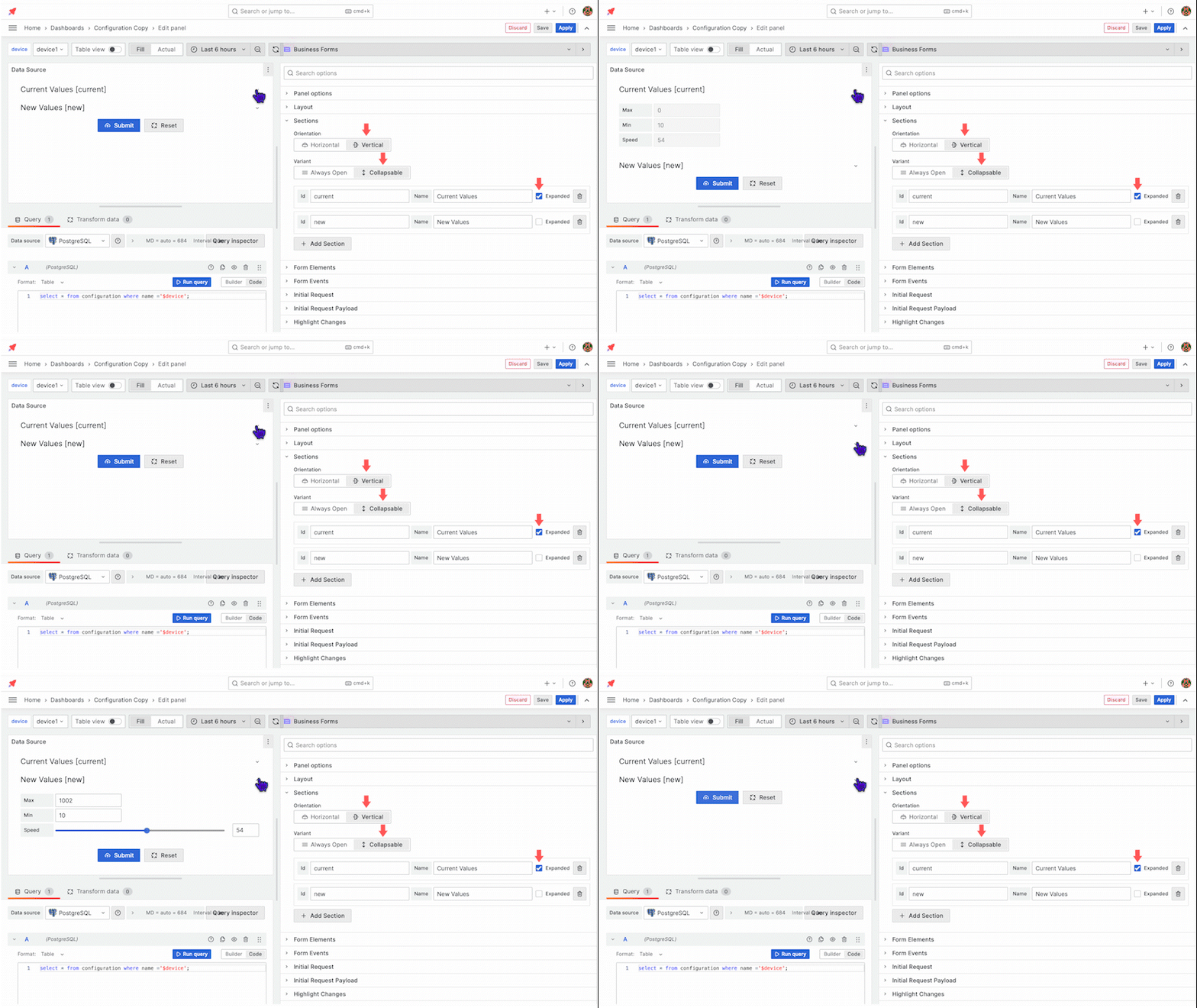
Collapsible sections.

In addition, you can control the Expanded and Collapsed states in the Custom code using the following commands:

context.panel.expandSection(id);
context.panel.collapseSection(id);
note

The full list of the Business Form panel parameters can be found in the Custom Code section of the panel's documentation.

Buttons Only

The standard Buttons Only, as the name implies, keeps only standard buttons on your form. The standard buttons include Submit, Reset, and Save default. With this layout, all panel options related to other form elements are hidden, which gives a cleaner Edit mode to work with.

Add a form element

Go to the Form Elements category to add a form element. Start by specifying ID, label, and type. After you click the Add Element button, more element options are available to configure.

Element types have specific options. For instance, the Text area type has Rows to regulate the element size on the dashboard.
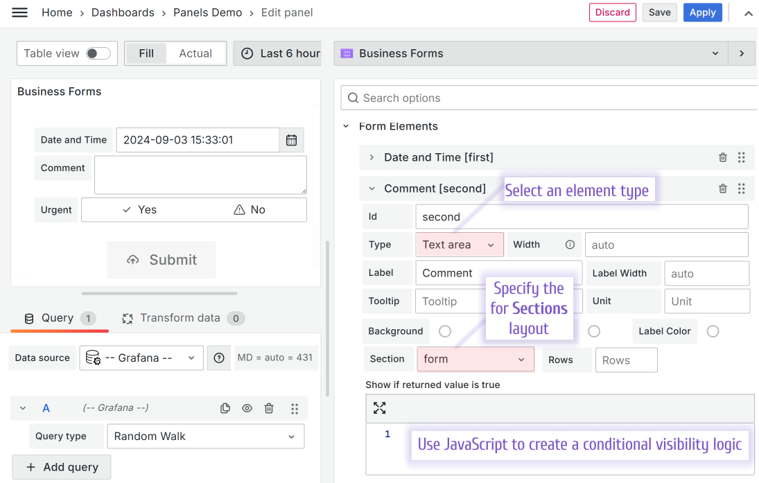
Form element in Edit mode.

Move a form element

Version

Supported starting from the version 3.0.0.

You can drag-and-drop form elements in the edit mode to change their order on the form.

Drag-and-drop form elements in Edit mode.

Form element types

The picture below illustrates all available element types prior to the version 4.4.0
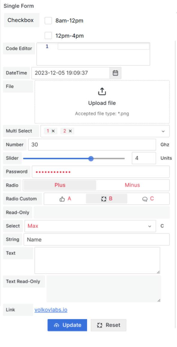
Form elements on UI.
Version

Custom buttons are supported starting from the version 4.4.0.

In addition to all other types, in release 4.4.0 we added a custom button type.

With the Button Form Elements type, you can have more functionality on your form, such as calculating a value, performing validation checks, or any other.

A user has some options to style a custom button. Colors, size, and position are up to configuration.

New Form Elements type - Custom Button.

With the Button place option, the custom button element can be placed among other Form Elements or in the form footer, next to the standard buttons.

Available options for the Button Form Elements type.

Checkbox list with custom options

The Checkbox list with custom options type allows to creation of multi-selection checkmark elements.

Checkbox list with custom options.

Specific for this element are the following options:

  • User options.

To add an option click the 'Add option' button and then specify an option type (number or string), value, and label.

Checkbox list with custom options.

Code Editor

The Code editor highlights keywords and formats the entered text. Specific for this element are the following options:

  • Language. Select between JSON and JavaScript.
  • Height. How high the entering window should be.
Options specific to the Code Editor type.

Date and Time

The Date and Time element gives access to the built-in date time Grafana component where a user can select a date and time using the familiar controls.

Date and time type is Grafana universal type.

Specific for this element are the following options:

  • Min. Sets the allowed minimum.
  • Max. Sets the allowed maximum.
Options specific to the Date and time type.
Version

The Time Zone option is available starting from version 4.0.0.

  • UTC. The date-time value is saved in the UTC zone,
  • Local. The date-time value is saved following the browser's time zone.
New Time Zones option for Date and time elements.

File

The File type allows users to access their file system to select a file. The file will be transferred as binary or Base64 encoded.

Specific for this element are the following options:

  • Accept. Lists the allowed file extensions. Example:
 .png,.gif
Options specific to the File type.

Example of the File type in a project

You can find an example of the File type in the following article. There we demonstrate how Data Manipulation can interact with other plugins (the Business Variable panel and the Base64 panel).

The Data Manipulation panel with a file upload feature is used twice in that example. One time to illustrate the configuration using Data Source and the other to HTTP API Server.

File upload using the Grafana dashboard.

If you are a visual style learner, you can watch the video. It covers the same ground.

File Upload using Grafana dashboard.

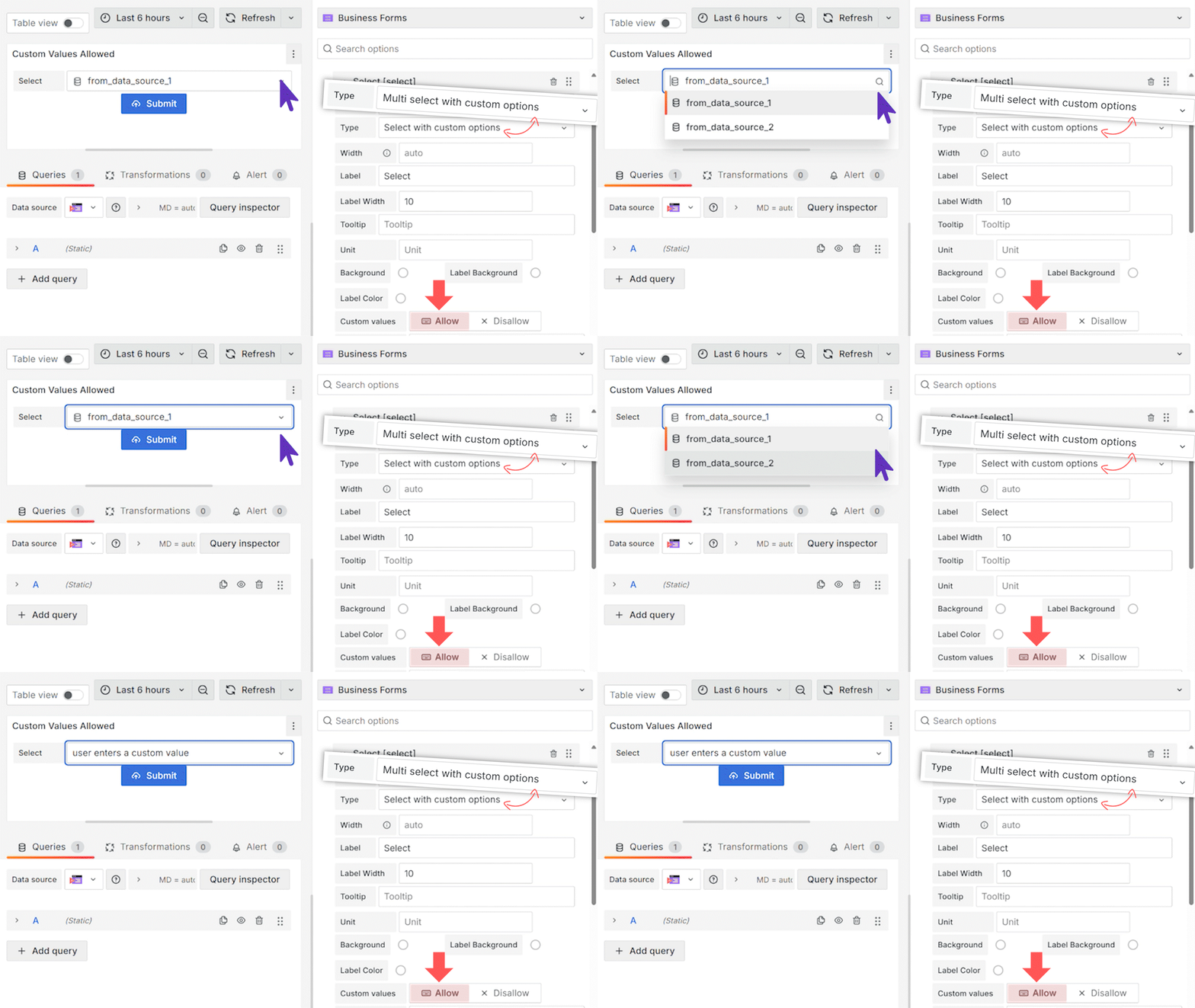
Multi-select with custom options

The Multi-select with custom options is a dropdown where users can select one or many options.

Specific for this element are the following options:

  • User options.

To add an option click the 'Add option' button and then specify an option type (number or string), value, label and select an icon from the given list.

Add custom options for the multi-select custom type.

Number Input

The Number Input is a text box where users enter a number manually.

Specific for this element are the following options:

  • Min. Sets the minimum allowed input number.
  • Max. Sets the maximum allowed input number.

Number Slider

The Number Slider is a horizontal line with a toggle that a user can drag left and right with a mouse. Alternatively, the user can enter the integer number manually.

Specific for this element are the following options:

  • Min. Sets the minimum allowed input number.
  • Max. Sets the maximum allowed input number.
  • Step. Sets the value of every move the toggle makes.

Password Input

The Password Input is a text box where every entered symbol is transformed into a dot.

This type does not have any specific options.

Radio Group with boolean options

The Radio Group with boolean options provides a user with a choice between True and False.

This type does not have any specific options.

Radio Group with custom options

The Radio Group with custom options provides a user with a choice between two or many options.

Specific for this element are the following options:

  • User options.

To add an option click the 'Add option' button and then specify an option type (number or string), value, label and select an icon from the given list.

Add custom options for the radio custom type.

Read-only

The Read-only type is sometimes also called the disabled type. It is a text box with a faded background and text. It does not allow a user to change the value it displays.

Specific for this element are the following options:

  • User options.

To add an option click the 'Add option' button and then specify an option type (number or string), value, label and select an icon from the given list.

Select with Custom options

The Select with Custom Options type is a dropdown where users can select one option.

Specific for this element are the following options:

  • User options.

To add an option click the 'Add option' button and then specify an option type (number or string), value, label and select an icon from the given list.

String Input

The String Input is a text box where a user manually enters a string value.

Specific for this element are the following options:

  • A visual control, a button, to make the element hidden.

Text Area

The Text Area is a rectangular area where a user can enter a text.

Specific for this element are the following options:

  • Rows. Sets the vertical size of the element.

Read-only Text Area

Version

Below is supported starting from the version 3.2.1.

This element type is similar to the Read-Only type with the difference that this one allows to display of multiple rows of text.

Version

Below is supported starting from version 3.2.1 and Grafana 10.1.0.

This element type allows you to add links to your Business form. The link text is customizable using the Link Text option. If not specified, the link address will be displayed.

Specific for this element are the following options:

  • Link text
  • Open in. The link can be opened in the same or a new tab.
The Link element type.

Common configuration

There are three form elements with select options.

  • Multi Select with Custom Options
  • Select with Custom Options
  • Radio Group with Custom Options

All three have some options in common.

Icon
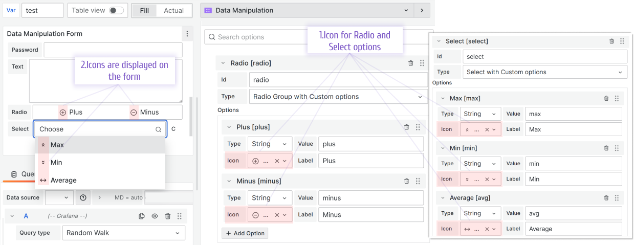
Optionally select an icon for this element.

Custom color/background color for elements

Version

Colors for elements supported starting from version 4.0.0.

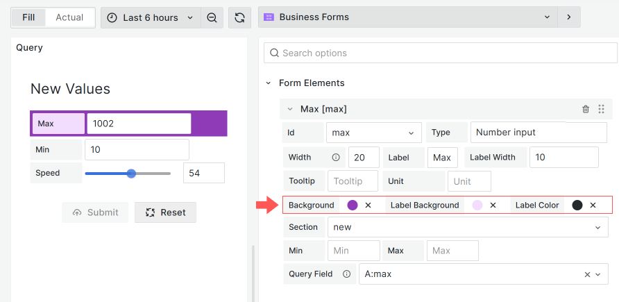
You can play with Form Elements colors. Configurable are:

  • Background color,
  • Label background,
  • Label color.
Color options
Color options

Select Options from Query

Version

Below is supported starting from the version 3.2.1.

Reference a query from any configured data source to populate form elements dynamically. You can specify the Label and Value fields.
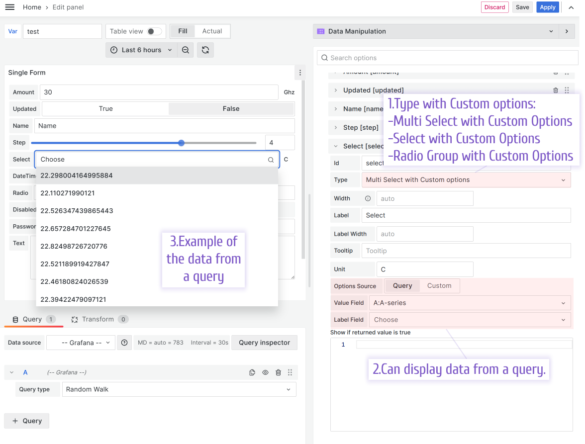
Use values from the query for your types with select options.

Select Options from Get Options Code

Version

Below is supported starting from the version 3.5.0.

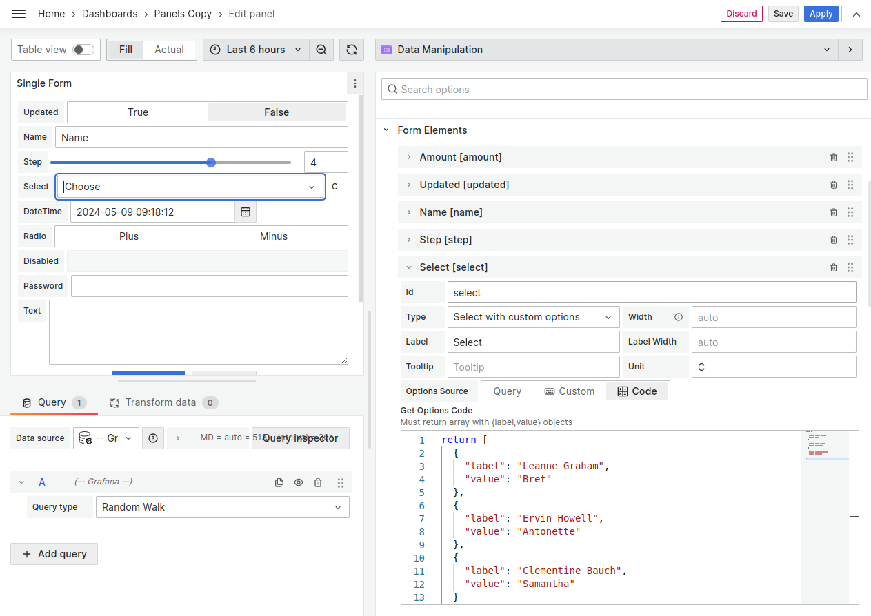
Get Options Code allows to hard code options using the code editor. The code must:

  • return array with {label,value} objects,
  • be synchronous.
Use hard-coded values from the Get Options Code for your types with select options.

Set Options received asynchronously

The Get Options Code does not support asynchronous code. However, you still can work with options received asynchronously.

It could be done in two steps:

Step 1. Initial Request.
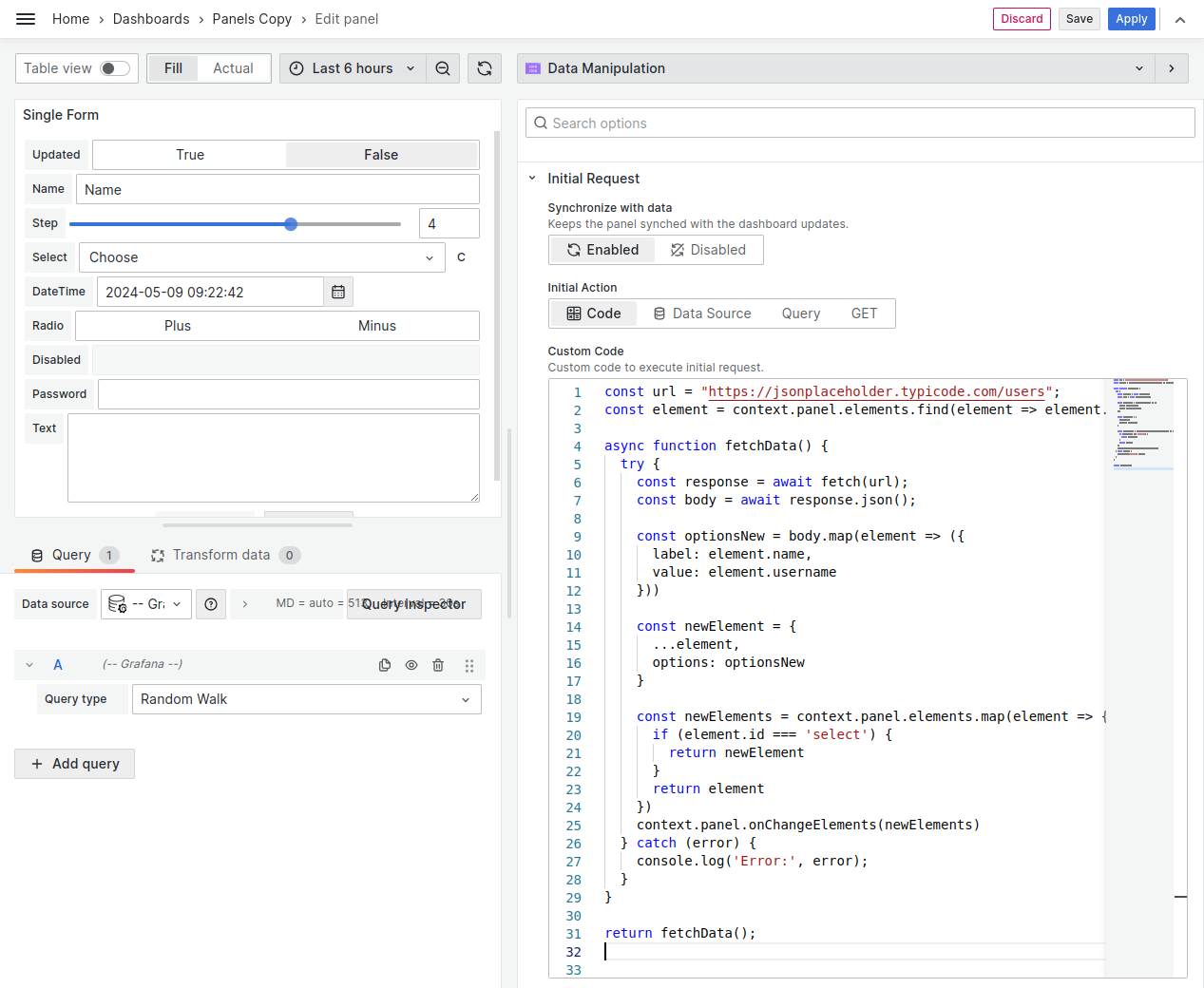
Initial request to work with options received asynchronously.

In the example below, we find a necessary element and update its options. Once the data has been received, we update the element using context.panel.onChangeElements().

const url = "https://jsonplaceholder.typicode.com/users";
const element = context.panel.elements.find(
(element) => element.id === "select"
);

async function fetchData() {
try {
const response = await fetch(url);
const body = await response.json();

const optionsNew = body.map((element) => ({
label: element.name,
value: element.username,
}));

const newElement = {
...element,
options: optionsNew,
};
const newElements = context.panel.elements.map((element) => {
if (element.id === "select") {
return newElement;
}
return element;
});
context.panel.onChangeElements(newElements);
} catch (error) {
console.log("Error:", error);
}
}

return fetchData();
Step 2. Create the GET Options Code

Set options for your element from context.panel.elements.
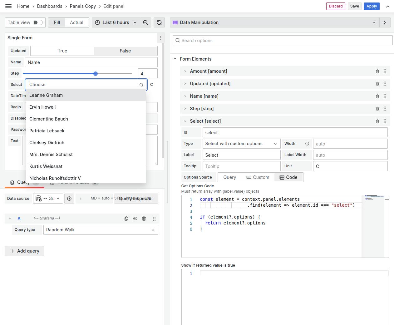
Get Options code for the Options received asynchronously
const element = context.panel.elements.find(
(element) => element.id === "select"
);

if (element?.options) {
return element?.options;
}

Conditional Visibility

Every form element has the Show If returned value is true parameter where you enter JavaScript code.

  • If this code returns true, the element is shown on the panel.
  • If this code returns false, the element is hidden from the panel.
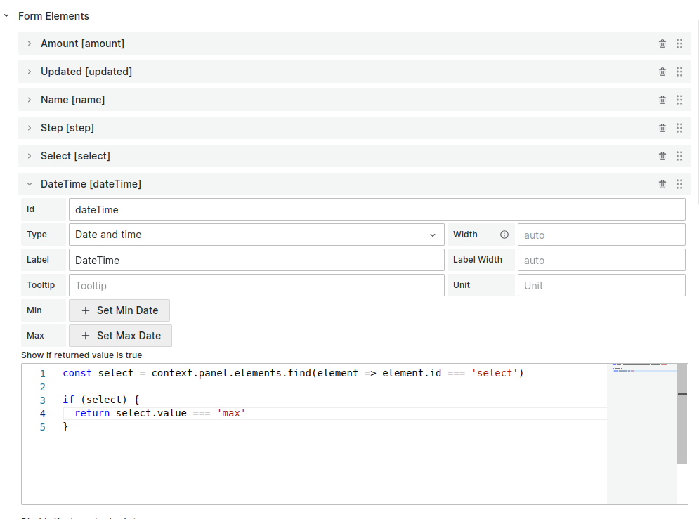
Conditional visibility example.

Example code to check the current value of the select element and show the dateTime element if the value equal to max:

const select = context.panel.elements.find(
(element) => element.id === "select"
);

if (select) {
return select.value === "max";
}
Version

Below is supported starting from the version 3.2.1.

You can use the dashboard and global variables within your JavaScript code.
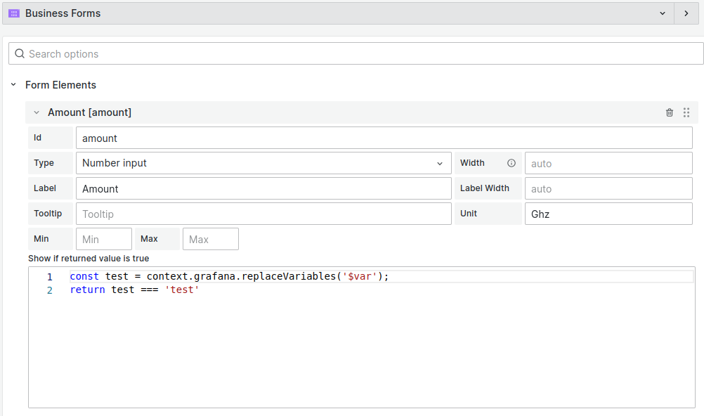
Conditional visibility using a dashboard variable example.

Example code to check the value of the dashboard variable var:

const test = context.grafana.replaceVariables("$var");
return test === "test";

Field Mapping

Version

Below is supported starting from 4.4.0

To map the Initial Form Elements values, use the Initial Fields options category.

Data source 4.4.0
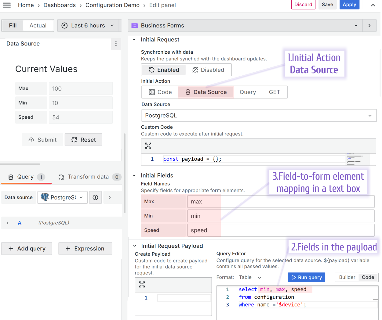
Steps to configure the Initial Request for Data Source. New location of `Field Name` fields.

Query 4.4.0

Explicitly specify the field-to-form element mapping for Query using Query Field. New location of Query Field fields since version 4.2.0
Version

Below is supported starting from version 3.2.1 to version 4.0.0

Using the Field name parameter for Data Source and the Query Field for Query, you can specify field-to-form mapping.

Data Source
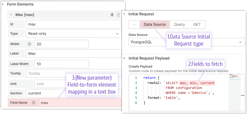
Explicitly specify the field-to-form element mapping for Data Source using Field name.

The Field Name option for each Form Element is located under the code editor when the data source option is enabled. Specify a field name for appropriate form element from the data source response.

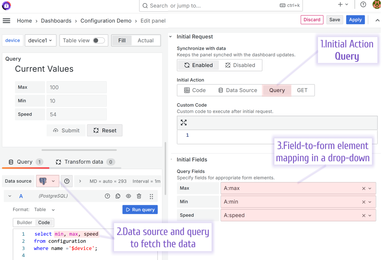
Query
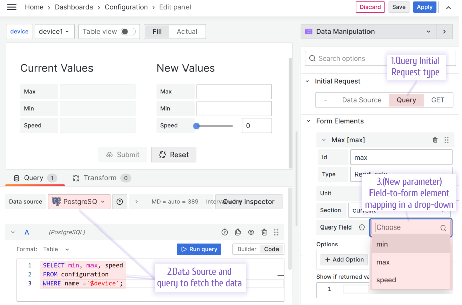
Explicitly specify the field-to-form element mapping for Query using Query Field.

The Query Field option for each Form Element is located under the code editor when the Query option is enabled. Specify a field name for appropriate form element from the Query response.