Features
The Business Table panel has the following features.
| Section | Description |
|---|---|
| Pagination | Explains pagination |
| Download Button | Demonstrates the Download button |
| External Export | Demonstrates the Table export |
| Infinity Data Source | Demonstrates how to use Infinity data source |
| Data links | Demonstrates data links |
| Standard options support | Explains the Standard options support |
| Data sources as variables | Explains Data sources as variables |
Pagination
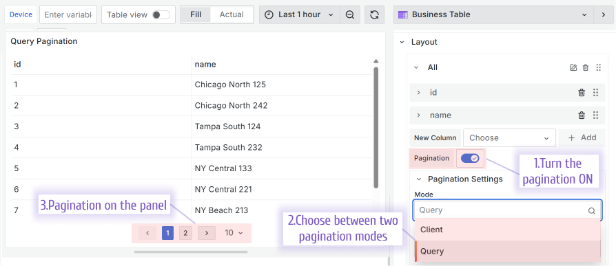
You have a choice of two pagination modes: Client and Query.
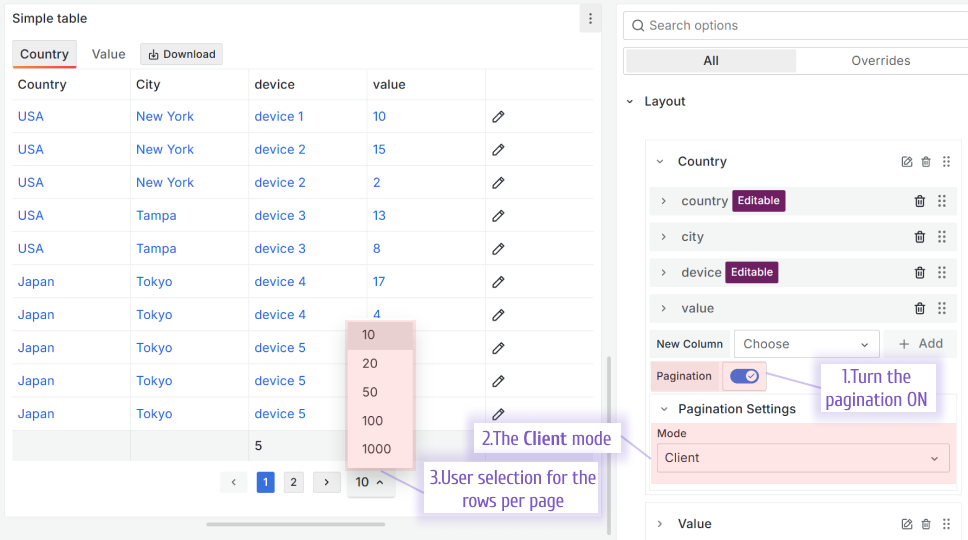
Client
With the Client mode, all records are retrieved by the Business Table panel simultaneously and then divided into the pages by your browser. By default, ten rows per page are displayed. A user can change it to 20, 50, 100 or 1000.
The Client mode is the easiest and fastest to set up. However, users might experience performance issues since all data must be retrieved before being separated into pages.
Query
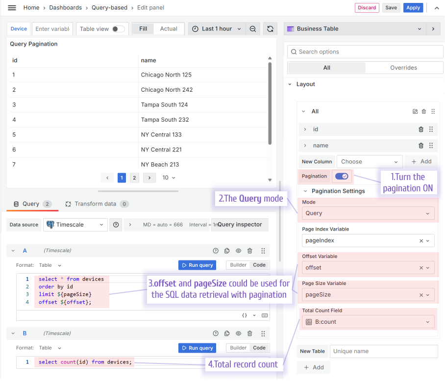
With the Query mode, only records needed for the current display are retrieved. That approach guarantees better performance for the end-users.
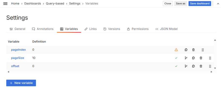
The determination of what records to retrieve (what records need to be displayed) is done by using the following variables:
- pageIndex. Page order number. Specify as a dashboard variable name.
- offset. How many rows to skip starting from the first. Specify as a dashboard variable name.
- pageSize. The number of rows per page. Specify as a dashboard variable name.
- Total Count Field. Specify as a dataframe:column name. Preffered to set to display total number of pages.
The necessity of the first three metrics (pageIndex, offset, pageSize) is contingent on the data source from which the data is sourced. Understanding this dependency will prepare you for efficient data retrieval.
In the example below, we use the Timescale data source, consequently SQL, to retrieve the data. pageIndex and offset are enough metrics in that case.
Default pagination size
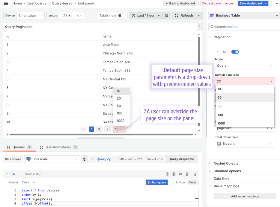
Starting from version 1.9.0, the Business Table supports the Default pagination size parameter.
With the default pagination size parameter, you configure how many rows per page are availabe when the dashboard loads for the first time. If a user changes that, it gets saved into the browser cookies for the user's convinience.
Data links
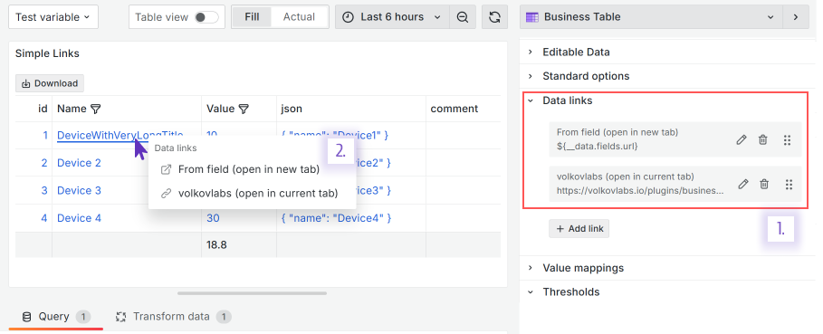
The Business Table visualization supports the Data links feature. In the example below, when a user clicks on a row, two links are suggested in the popup window.
You can use the Grafana Overrides feature to configure column links (not for the whole row).
Update variables using data links
Data links help expose additional functionality of the Business Table. Changing a variable through the table can be implemented as follows.
Configure the Data Links option
/d/${__dashboard.uid}?${__url_time_range}&var-Test=${__data.fields.device}
where __data.fields.device uses the value from the device field in the current row when the cell is clicked. This is how the variable will be changed. In string var-Test the substring Test is the variable to be replaced.
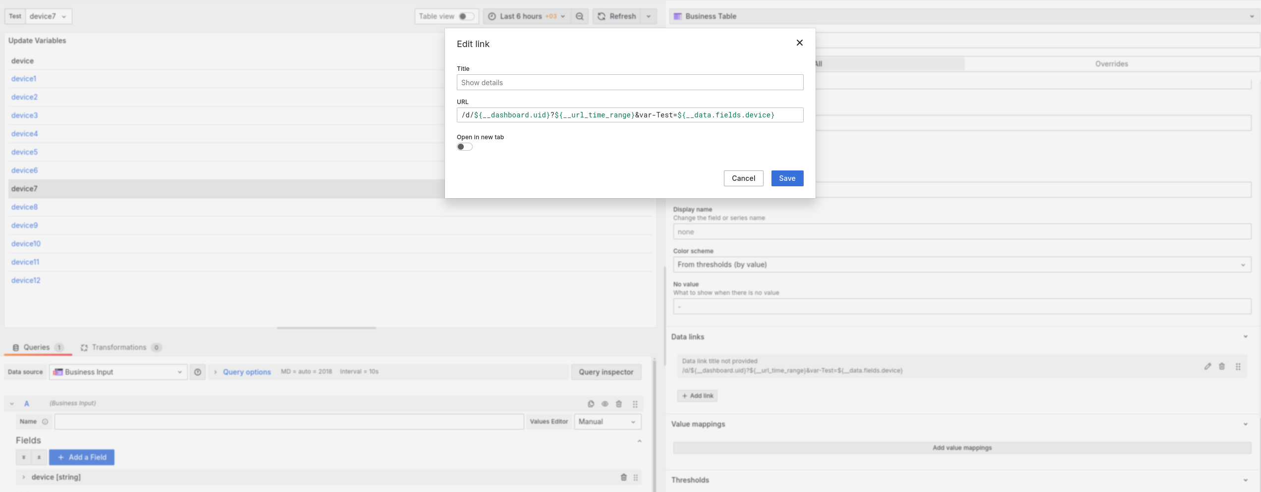
Clicking on a cell with the value device10 will change the value of the Text variable.

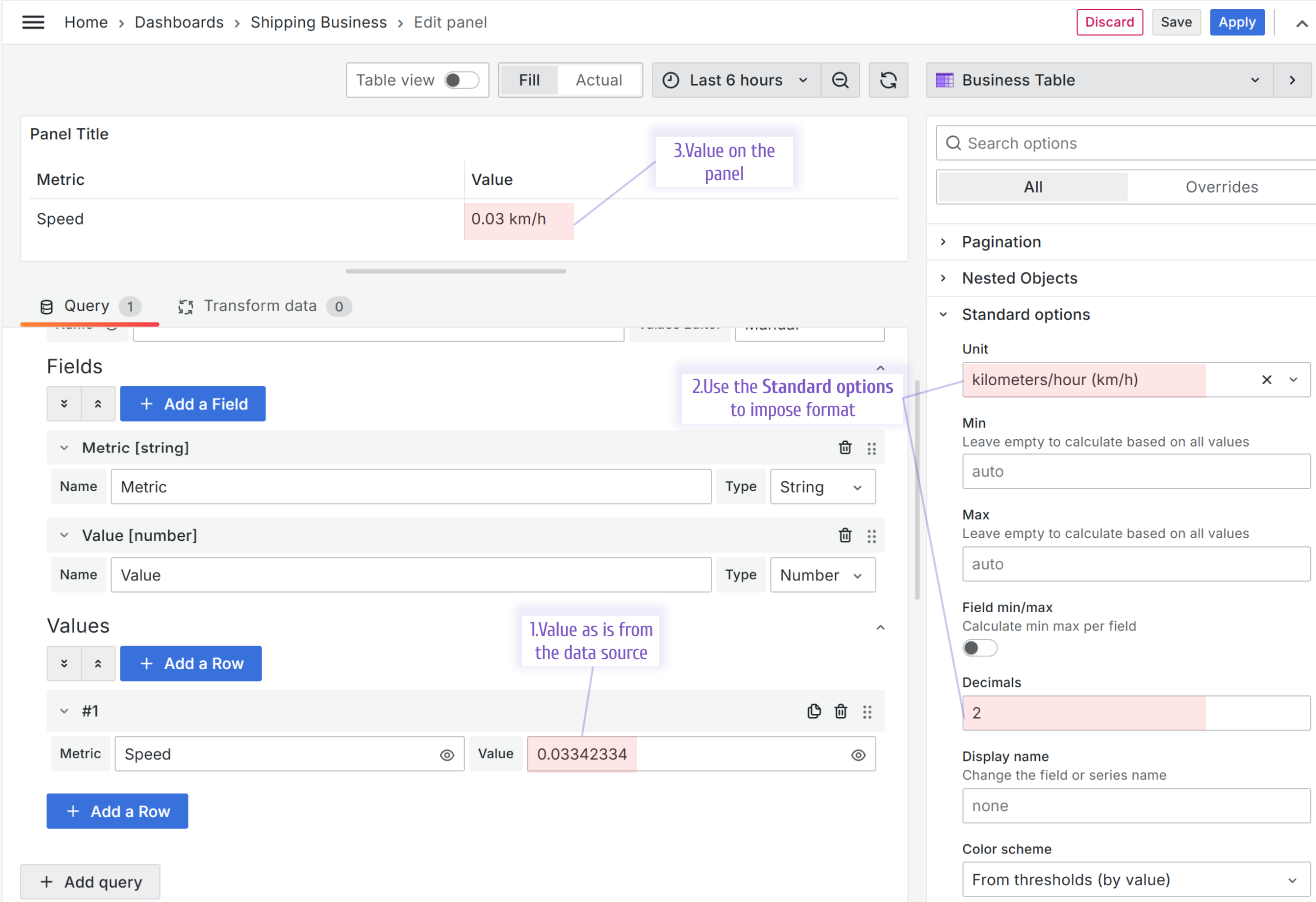
Support of the Standard options
The feature is supported starting from version 1.5.0
The values displayed in the Business Table visualization can be formatted using the Grafana Standard options.
Data sources as variables
The feature is supported starting from version 1.9.0
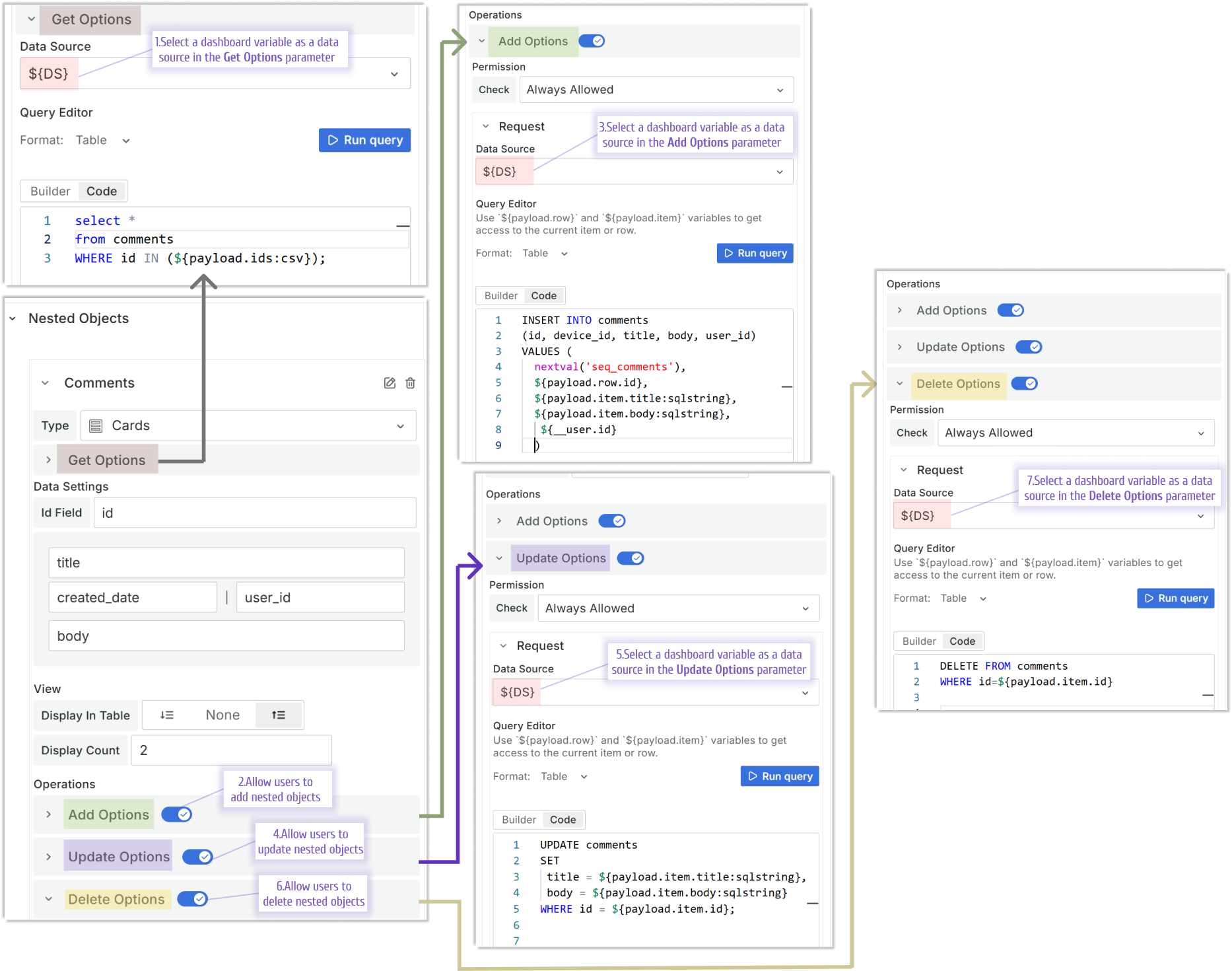
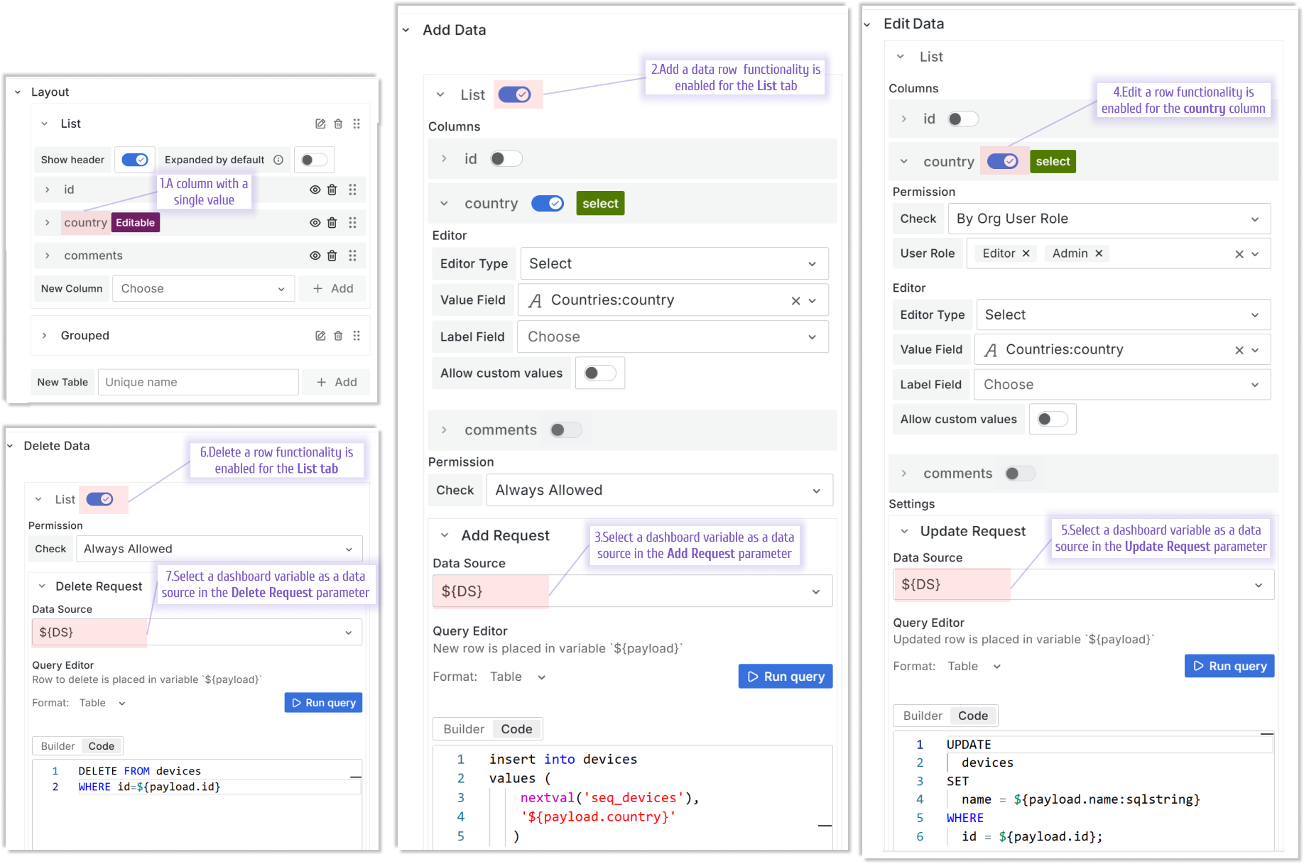
All Business Table data flows are configurable separately, allowing unbeatable flexibility. Starting from this release, a data source in every flow can be specified as a variable.
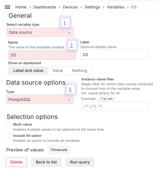
Let's say a Grafana dashboard has the following dashboard variable:
- Variable type: Data source,
- Name: DS,
- Type: PostgreSQL.
You can use this variable in every data flow that affects:
- row,
- nested objects stored as a column value.
Row
Rows has three possible data flows:
- Add data. Executed:
- if the add a row functionality is allowed,
- after a user clicks on a (+) icon to add a new row.
- Editable data. Executed:
- if the edit a row functionality is allowed,
- after a user clicks on the pencil icon to edit a row.
- Delete data. Executed:
- if the delete a row functionality is allowed,
- after a user clicks on a trash can icon to delete a row.
Nested objects
Nested objects have four possible data flows:
- Get Options
- on the form load to populate the column from a data source.
- Add Options
- if the Add Options functionality is allowed,
- after a user opens Show All comments drawer and clicks on the Add button.
- Update Options
- if the Update Options functionality is allowed,
- after a user opens Show All comments drawer and clicks on the pencil button.
- Delete Options
- if the Delete Options functionality is allowed,
- after a user opens Show All comments drawer and clicks on the trash can button.
