Add and delete rows, new column and editor types, Grafana 11.3 Scenes updates in Business Table 1.9.0
We are excited to announce the release of the Business Table panel 1.9.0. This feature release includes the following updates:
- Ability to add and delete a row.
- Option to hide the table header.
- Support variables in the data sources for all data flow configurations.
- Custom values in editable select type fields.
- New column types:
- Image,
- Preformatted,
- Boolean,
- Rich text.
- New editor types:
- Text Area,
- Switch.
- New parameter default pagination size.
- Compatibility with Grafana 11.3 and Scenes-powered dashboards.
Downloads
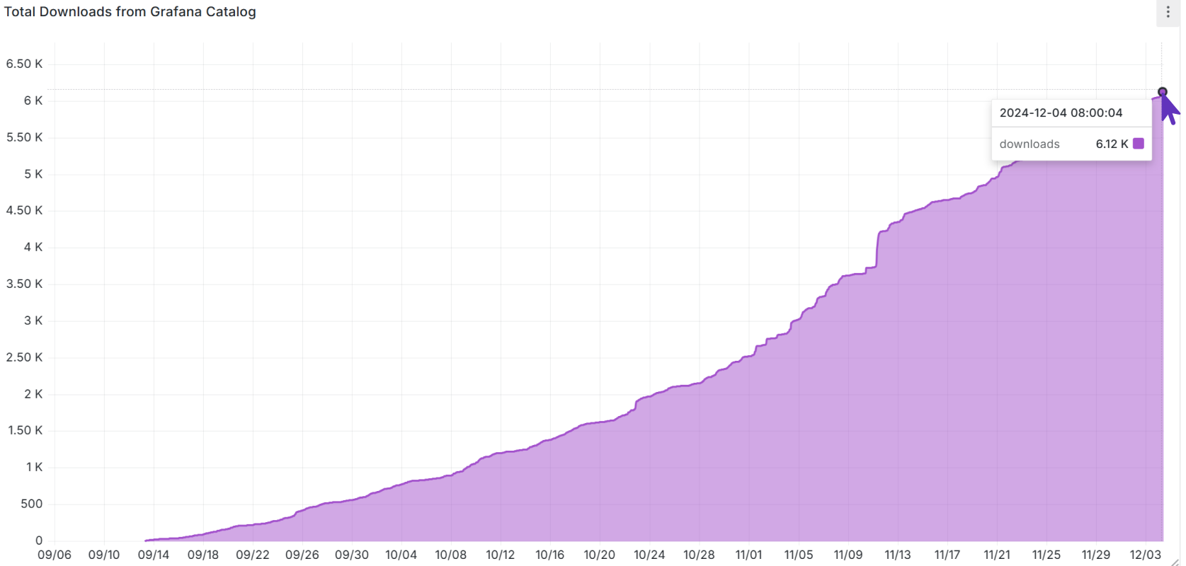
The Business Table downloads number is a generous Community gift to us. We are thrilled with 6,000 downloads. Let's see what the latest release will do with this plugin adoption.
Ability to add and delete a row
This is the most requested feature. Starting from this release, an end user of your Business Table panel can add and remove rows from Grafana dashboard!
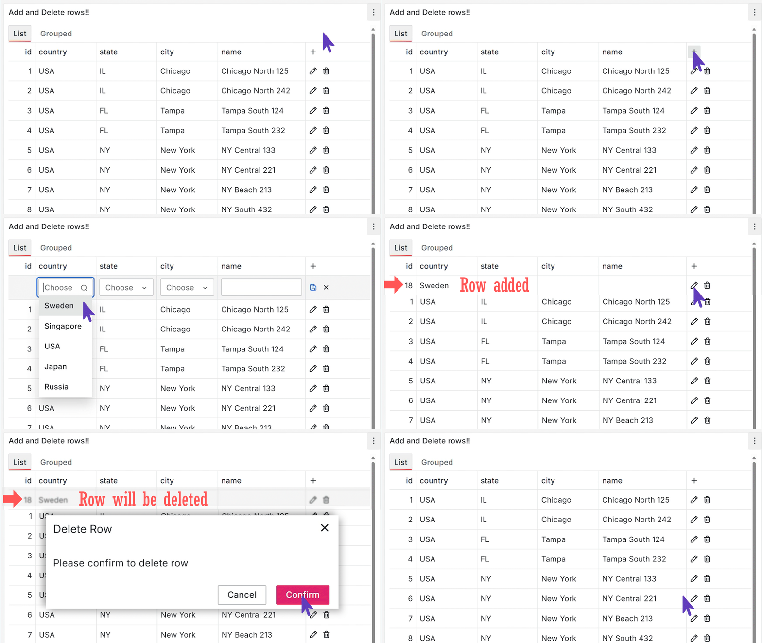
Below are details on how you can configure this new feature.
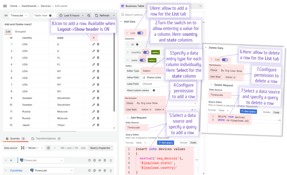
Use Add data parameter category to configure:
- Which tabs of your Business Table panel should allow to add a row.
- What columns should a user specify while adding a new row. It is done by turning on the switch next to a column name.
- The Editor Type is a UI element to enter a new value.
- Permission is a granular control of who is allowed to add a new row. It is configured per each tab individually.
- Add Request consists of a data source and the query.
Use Delete data parameter category to configure:
- Which tabs of your Business Table panel should allow to delete a row.
- Permission is a granular control of who is allowed to delete a row. It is configured per each tab individually.
- Delete Request consists of a data source and the query.
Option to hide the table header
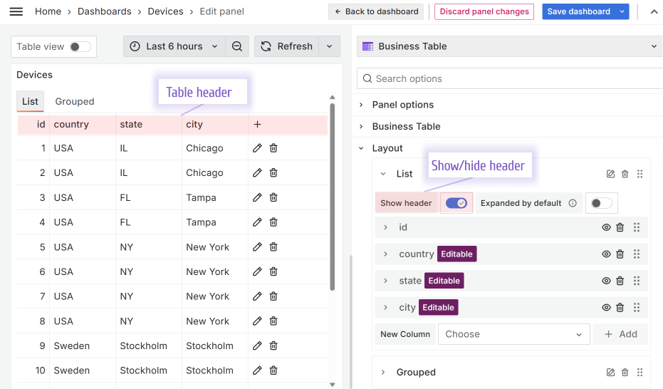
You can hide the Business Table header from the dashboard by turning off the Layout->Show header switch.
Support variables in the data sources for all data flow configurations
All Business Table data flows are configurable separately, allowing unbeatable flexibility. Starting from this release, a data source in every flow can be specified as a variable.
Let's say a Grafana dashboard has the following dashboard variable:
- Variable type: Data source,
- Name: DS,
- Type: PostgreSQL.
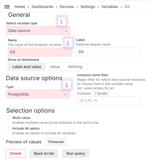
You can use this variable in every data flow that affects:
- row,
- nested objects stored as a column value.
Row
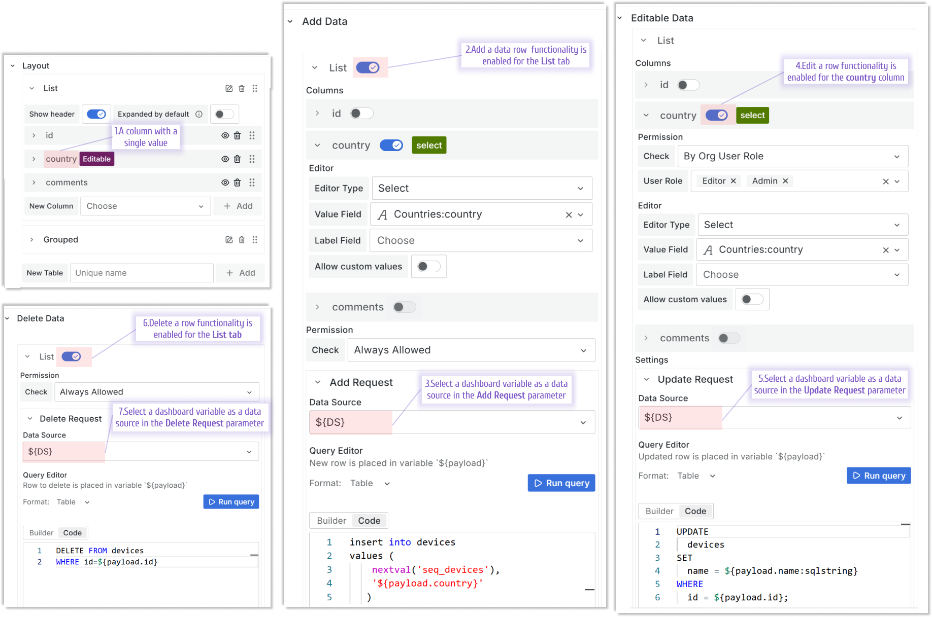
Rows has three possible data flows:
- Add data. Executed:
- if the add a row functionality is allowed,
- after a user clicks on a (+) icon to add a new row.
- Editable data. Executed:
- if the edit a row functionality is allowed,
- after a user clicks on the pencil icon to edit a row.
- Delete data. Executed:
- if the delete a row functionality is allowed,
- after a user clicks on a trash can icon to delete a row.
Nested objects
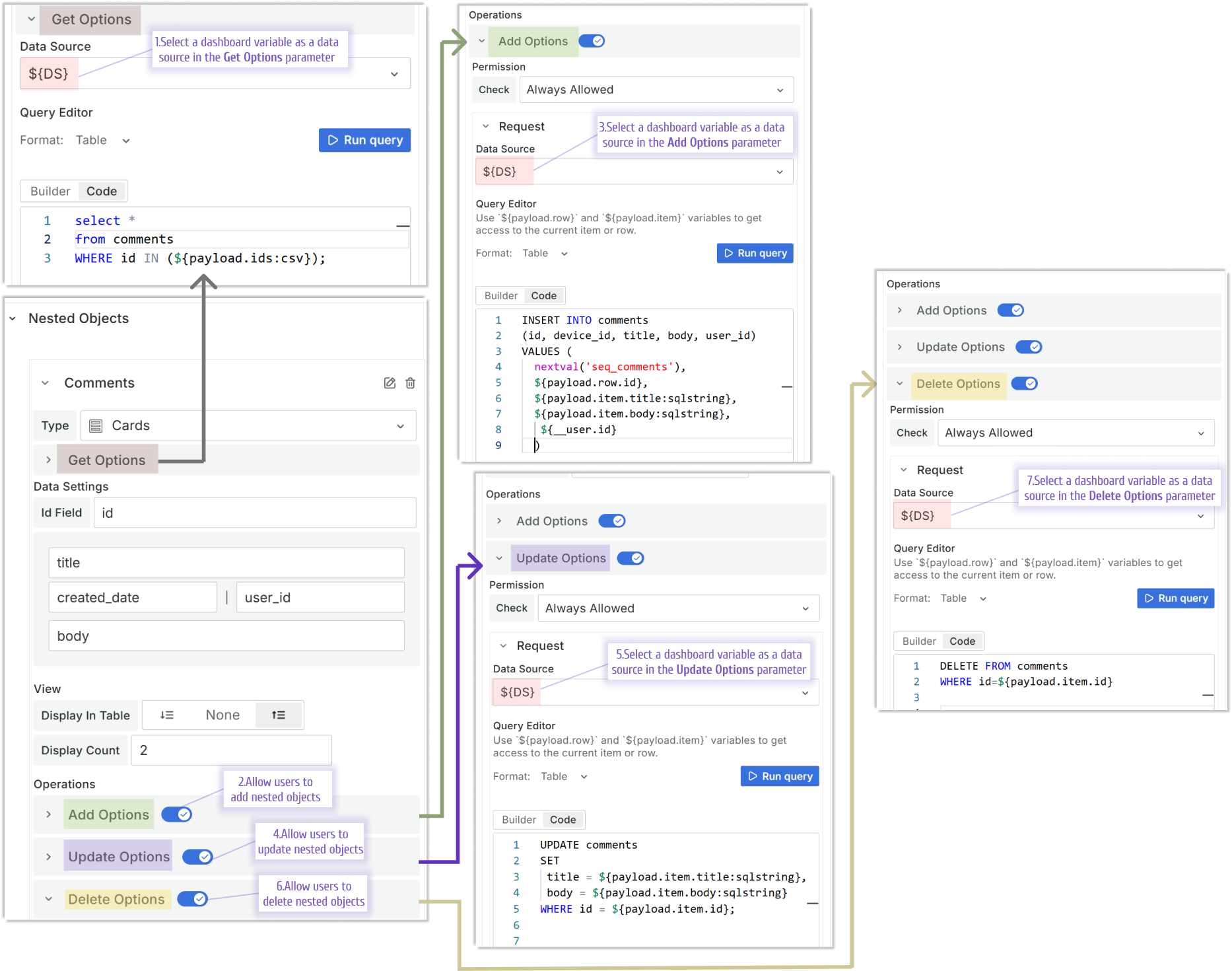
Nested objects have four possible data flows:
- Get Options. Executed:
- on the form load to populate the column from a data source.
- Add Options. Executed:
- if the Add Options functionality is allowed,
- after a user opens Show All comments drawer and clicks on the Add button.
- Update Options. Executed:
- if the Update Options functionality is allowed,
- after a user opens Show All comments drawer and clicks on the pencil button.
- Delete Options. Executed:
- if the Delete Options functionality is allowed,
- after a user opens Show All comments drawer and clicks on the trash can button.
Custom values in editable select type fields.
The Select is one of the types that you can use to add or edit a column value.
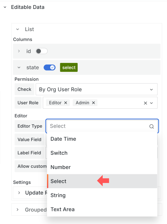
Starting from this release, in addition to selecting from a pre-populated drop-down list, a user can enter a custom value.
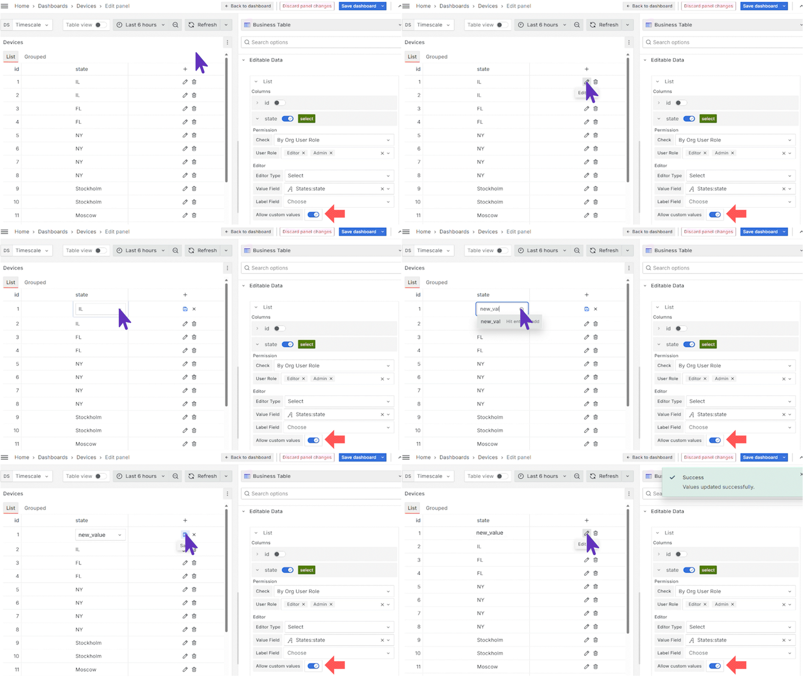
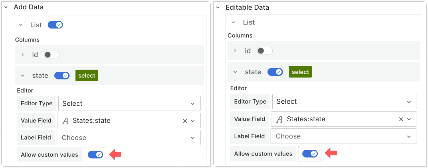
To allow that, ensure to set Allow custom value to ON.
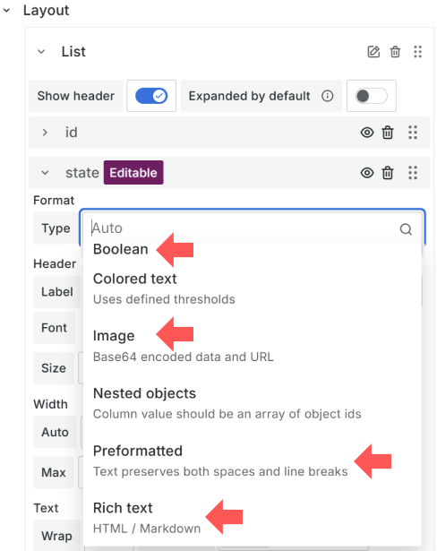
New column types
A column type is specified in the Layout category and determines what the data looks like when displaying for a user review.
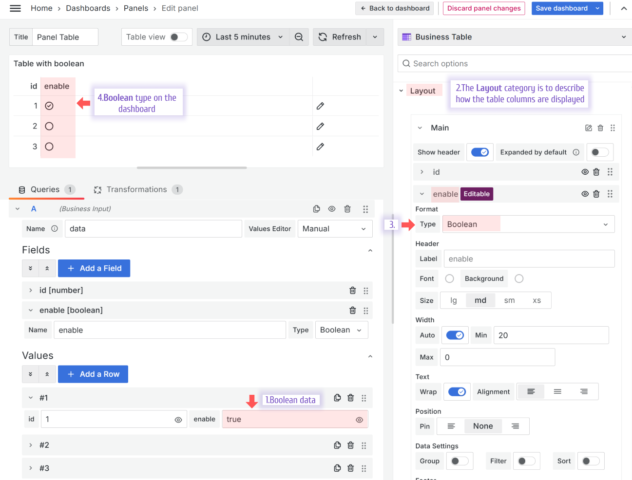
Boolean
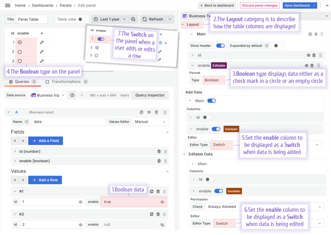
The Boolean type displays a checkmark in a circle for a true value and an empty circle for a false value.
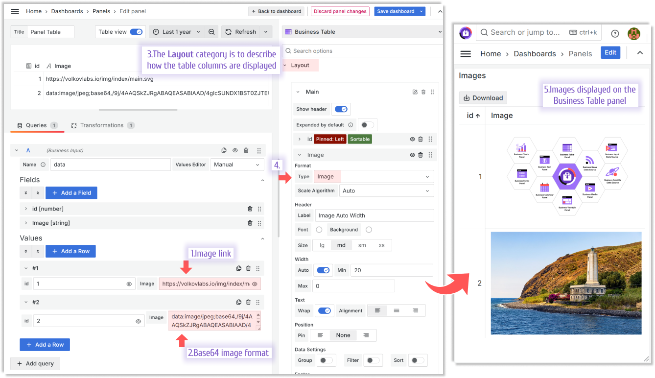
Image
The Image type interprets the image links and base64 formats.
Preformatted
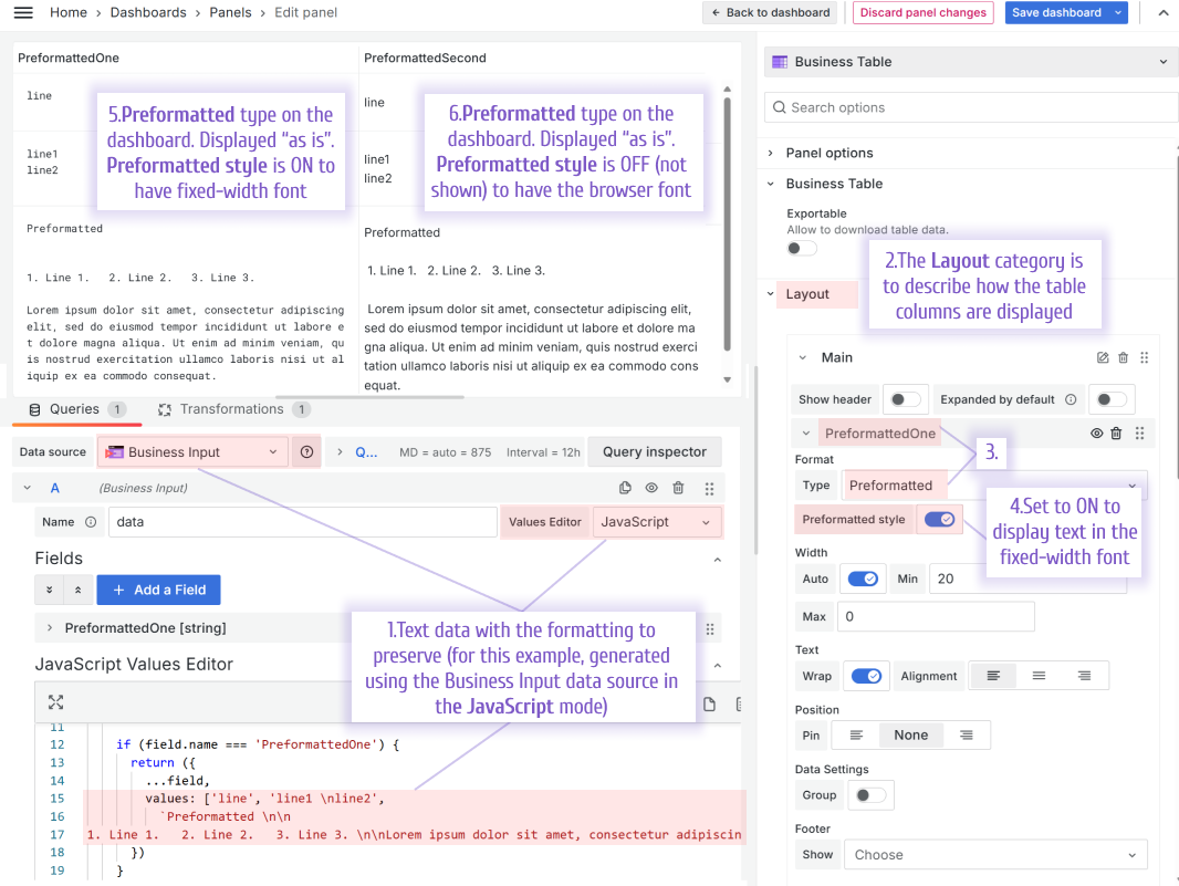
The Preformatted type, which is similar to the pre HTML tag, is designed to display text with spaces and line breaks preserved. This means the text is shown exactly as it is written, without any formatting changes.
If the Preformatted style switch is ON, the text is displayed in the fixed-width font. If the Preformatted style switch is off, the text is displayed in the font configured for the user's browser.
Rich text
The Rich text type interprets sanitized HTML and Markdown.
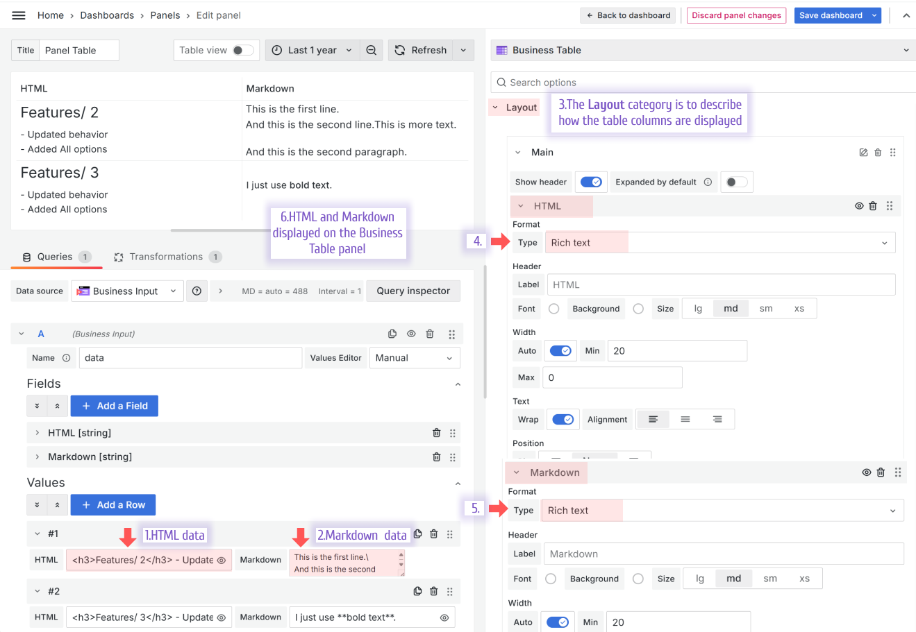
HTML from the example above:
<h3>Features/ 2</h3>
- Updated behavior <br />
- Added All options<br />
Markdown from the example above:
This is the first line.\
And this is the second line.
New editor types
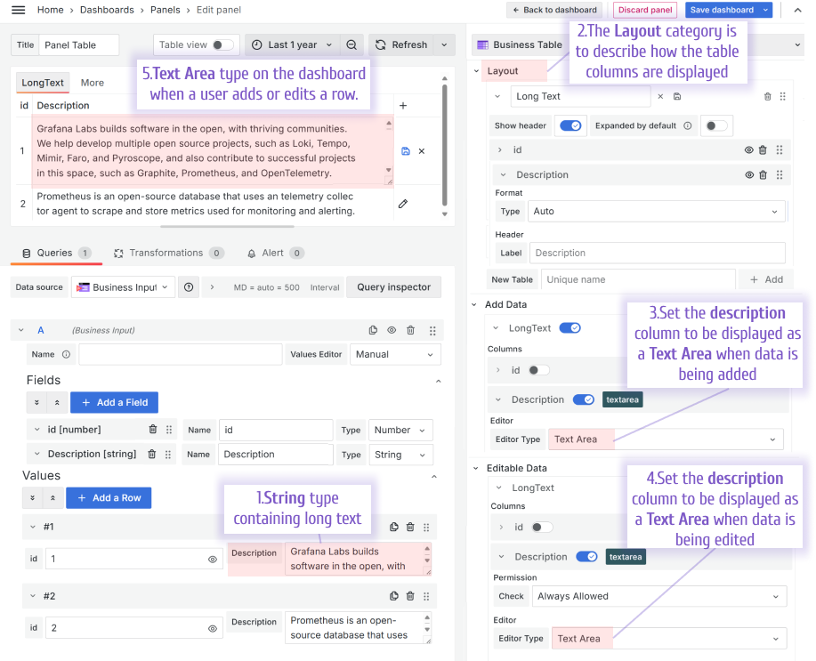
An editor type is specified in the Add Data and Editable Data categories and determines what the data looks like when a user adds or edits the data, respectively.
Text Area
The Text Area editor type is designed to add and edit multi-row text values.
Switch
The Switch editor type makes the user's work with the Business Table panel more intuitive while transforming the boolean type data into a switch that can be turned on and off.
Default pagination size
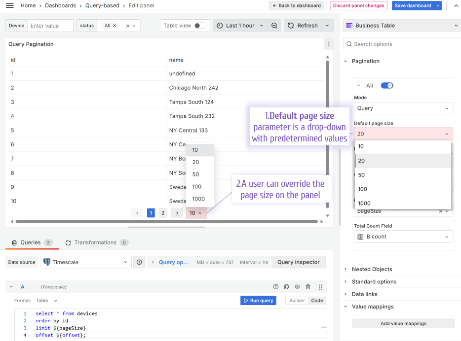
With the default pagination size parameter, you configure how many rows per page are availabe when the dashboard loads for the first time. If a user changes that, it gets saved into the browser cookies for the user's convinience.
Compatibility with Grafana 11.3 and Scenes-powered dashboards
The Scenes powered dashboards in Grafana 11.3 release introduced some breaking changes for our plugins.
Starting from release 1.9.0, the Business Table panel fully migrated to support Grafana 11.3.
Getting Started
The Business Table panel can be installed from the Grafana Catalog or utilizing the Grafana command line tool.
For the latter, please use the following command.
grafana cli plugins install volkovlabs-table-panel
Tutorial
The Business Table 1.9.0 for Grafana brings an exciting functionality when a user can add, edit and delete rows from the Grafana dashboard. In addition, the Business Table 1.9.0 features useful functionality such as Grafana Thresholds, displaying images, easy connections with other Grafana panels and more!
We have many other tutorials that you can find helpful. You can review all related to this plugin tutorials here.
Release Notes
Features / Enhancements in 1.9.0
- Added Image cell type (#177)
- Updated Autosize Code Editor (#179)
- Added default pagination size (#181)
- Added preformatted cell type (#180)
- Updated table cells border (#183)
- Added functionality to add and delete row (#184)
Features / Enhancements in 1.8.0
- Updated sort state on dashboard refresh (#163)
- Added support variables in data sources for editable and nested objects (#167)
- Updated group expand and collapse behavior (#161)
- Added custom value to editable select field (#165)
- Updated group expanding for empty cells (#169)
- Added type check for text area (#172)
- Updated behavior for edit process (error with TextArea initial value) (#176)
Features / Enhancements in 1.7.0
- Updated useNestedObjects hook to display request errors and empty values (#158)
- Added Sanitized HTML and Markdown column type (#154)
- Updated rows heights when group collapse (#159)
- Updated filter options to match exactly (#160)
- Updated data source name to id (#156)
- Added option to hide table header (#157)
Features / Enhancements in 1.6.0
- Updated refresh and useRuntimeVariables for dashboard scene (#129)
- Added replaceVariables to file name (#131)
- Added Textarea column editor type (#133)
- Added replaceVariables to column header (#134)
- Updated to Grafana 11.3. and dependencies (#137)
- Added colored Text and colored Background for aggregated rows (#136)
- Added Handling Data Source Request Errors (#140)
- Added customization for column header (#141)
- Updated text wrap (#143)
Volkov Labs Is Now Closed
Following our acquisition, Volkov Labs has officially ceased operations as of September 26, 2025. We are no longer accepting feedback, support requests, or partnership inquiries. The Business Suite for Grafana repositories have been archived on our GitHub organization, and no further development or support will be provided.
We are deeply grateful for the incredible support from our community and partners over the past four years.


