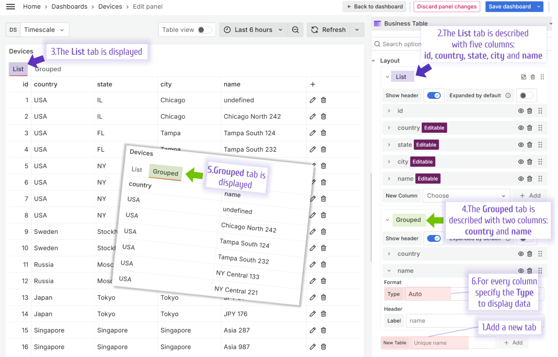
Layout
The Layout parameter category determines the set of tabs and then the set of columns and their display types for each tab.
Column types to display data
A column display type is specified in the Layout->Format->Type and determines what the data looks like when displaying for a user review. At this moment, there are 8 available types to choose from.
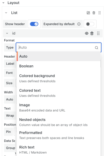
Auto
Same as Colored text. Used by default.
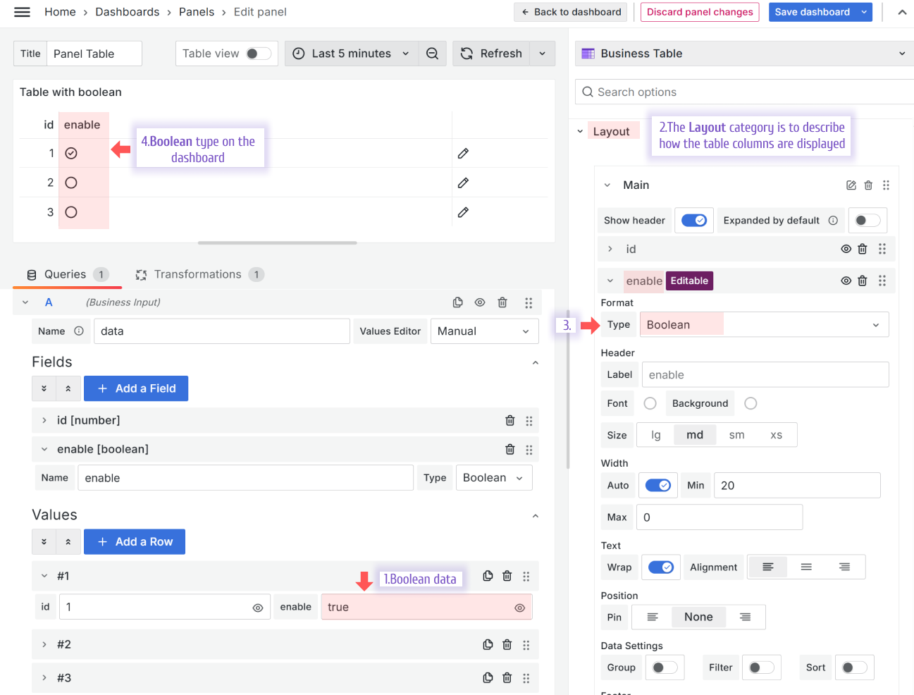
Boolean
The Boolean type displays a checkmark in a circle for a true value and an empty circle for a false value.
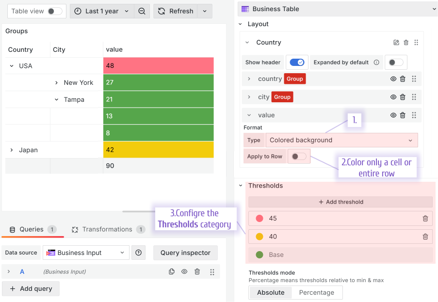
Colored Background
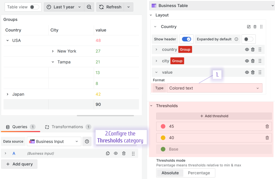
The Colored background types changes the cell background colors following the Grafana Thresholds configuration.
Using the Apply to Row parameter, you can color the whole row(not shown) or only one cell (as shown).
Colored text
The Colored text types changes the cell font colors following the Grafana Thresholds configuration.
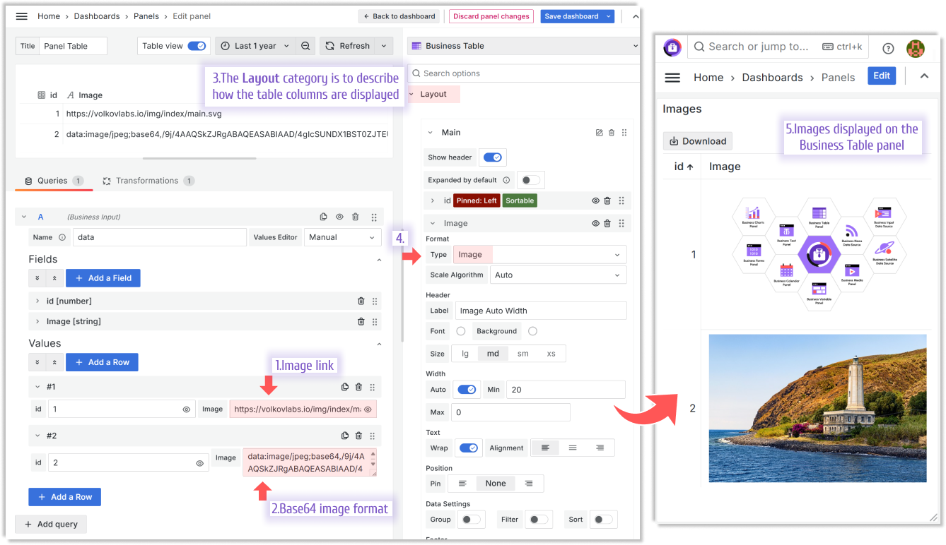
Image
The Image type interprets the image links and base64 formats.
Nested objects
See the Nested Ojects section of this documentation.
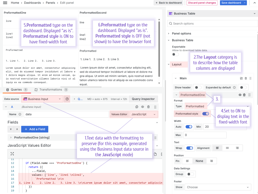
Preformatted
The Preformatted type, which is similar to the pre HTML tag, is designed to display text with spaces and line breaks preserved. This means the text is shown exactly as it is written, without any formatting changes.
If the Preformatted style switch is On, the text is displayed in the fixed-width font. If the Preformatted style switch is Off, the text is displayed in the font configured for the user's browser.
Rich text
The Rich text type interprets sanitized HTML and Markdown.
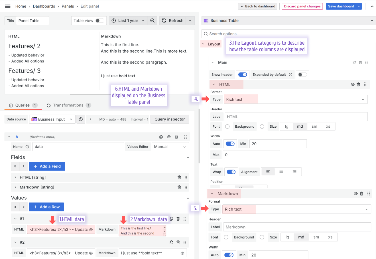
HTML from the example above:
<h3>Features/ 2</h3>
- Updated behavior <br />
- Added All options<br />
Markdown from the example above:
This is the first line.\
And this is the second line.
Other Layout parameters
| Section | Description |
|---|---|
| Multi tables as tabs | Demonstrates multi table as tabs |
| Tree View/Row Grouping | Demonstrates tree view/row grouping |
| Auto-width columns | Demonstrates auto-width columns |
| Table footer | Explains how the table footer works |
| Filtering in the Client and Query modes | Demonstrates the Client and Query filtering |
| Sorting | Demonstrates column sorting |
| Pin Columns | Demonstrates column pinning |
| Show and hide columns | Demonstrates the show/hide column button |
| Hide the table header | Explains how to hide the table header |
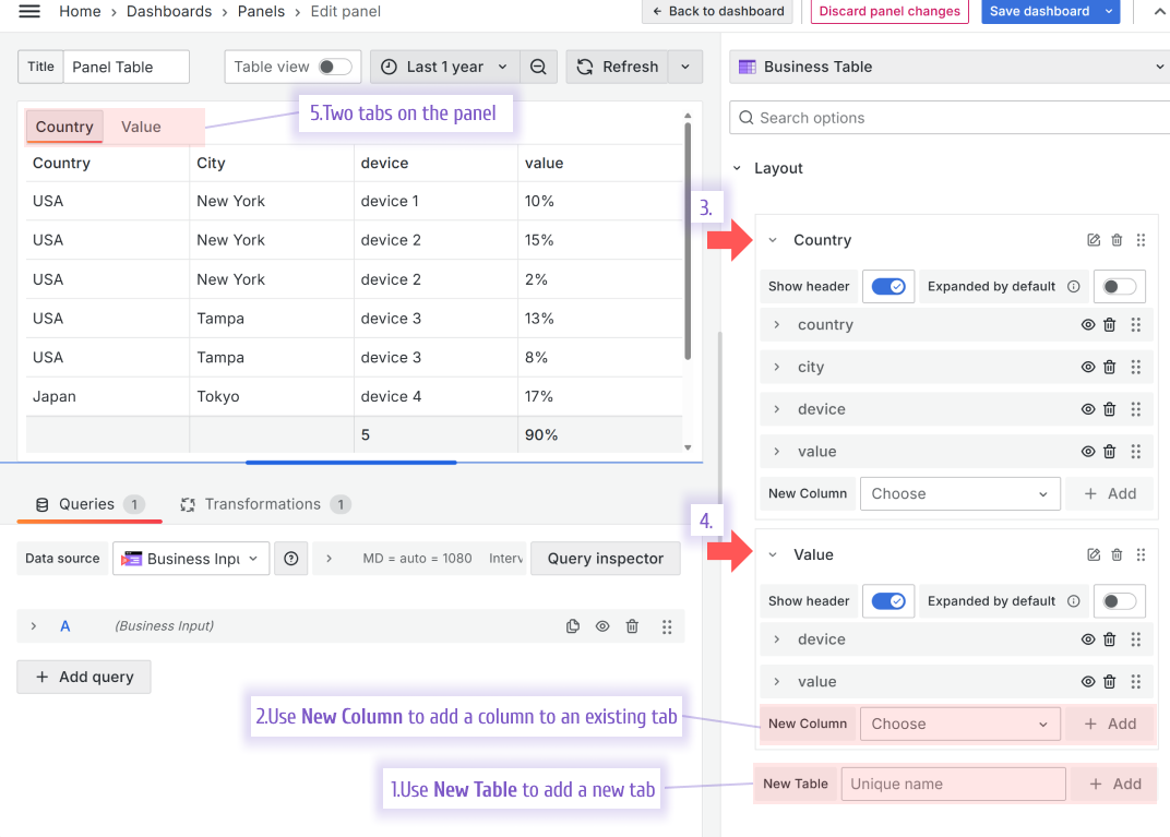
Multi tables as tabs
The Business Table panel allows you to have a multi-tabs view and configure the fields of each tab separately.
To add a new tab, use the New Table parameter. To add a column to an existing tab, use the New Column parameter.
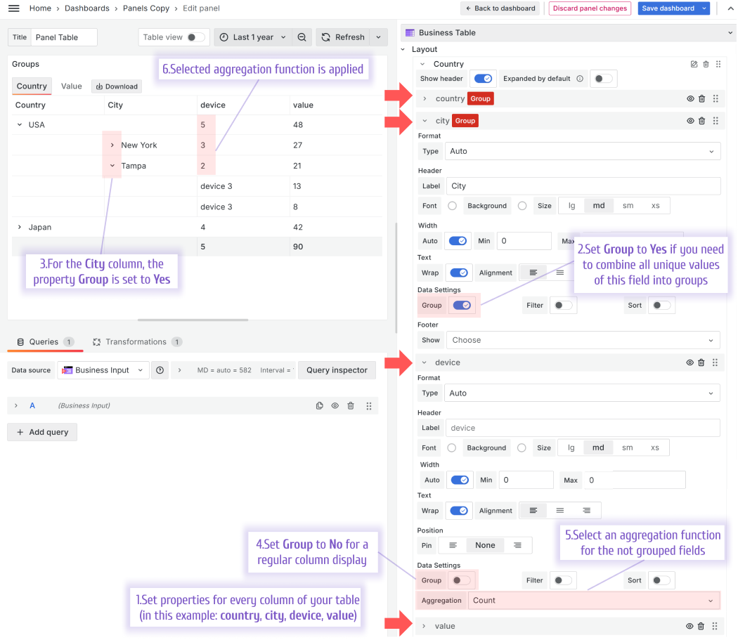
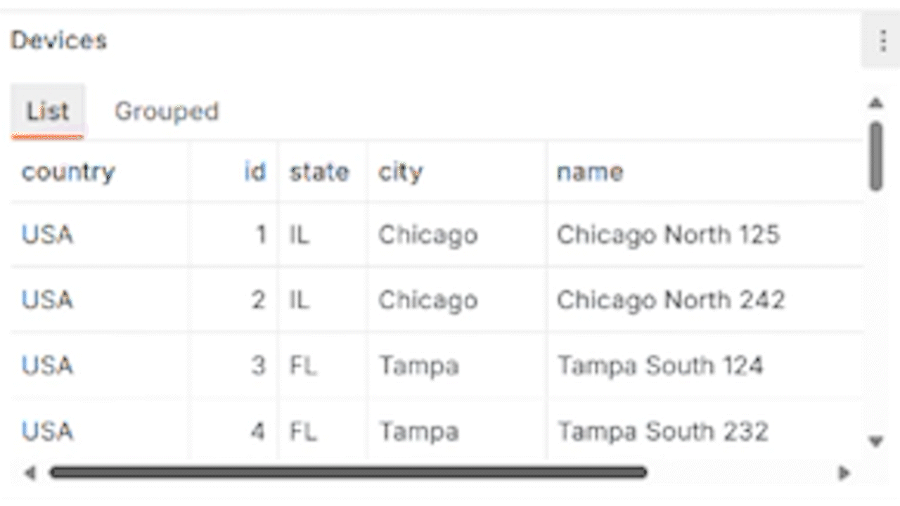
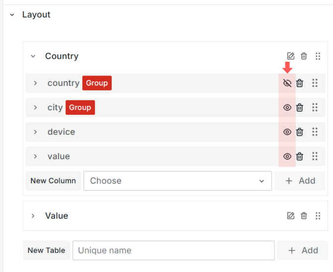
Tree View/Row grouping
This feature allows you to combine unique field values into groups and collapse/expand using little arrows to create a layout similar to Tree View.
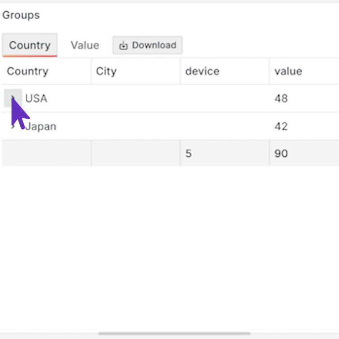
Below is the steps of how to configure Business Table panel Tree View.
Auto-width columns
The column width can be determined automatically within a specified range or explicitly hardcoded by a user in pixels.
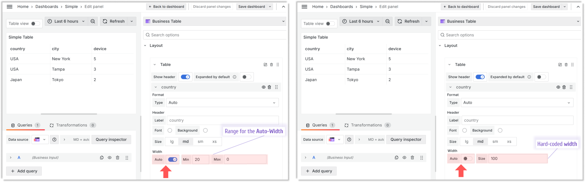
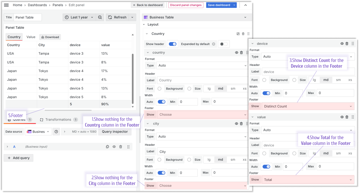
Table footer
Every column of the Business Table panel has the Show in Footer property. If at least one column has it set up, then a footer will be shown.
You can select the aggregation function individually for each column to be applied toward the value displayed in the footer.
Filtering
The Business Table panel starts strong with the filtering feature offering two main options:
- Client,
- Query.
Client
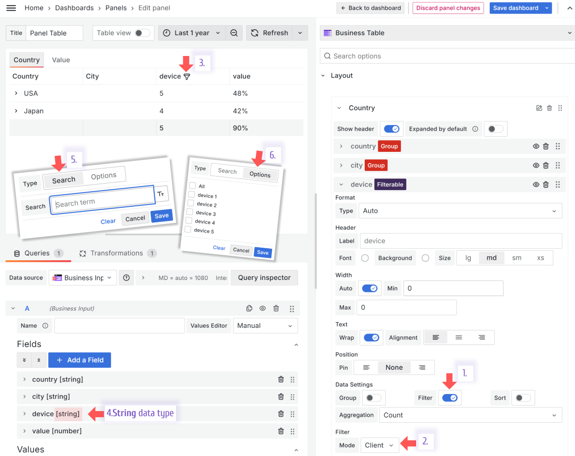
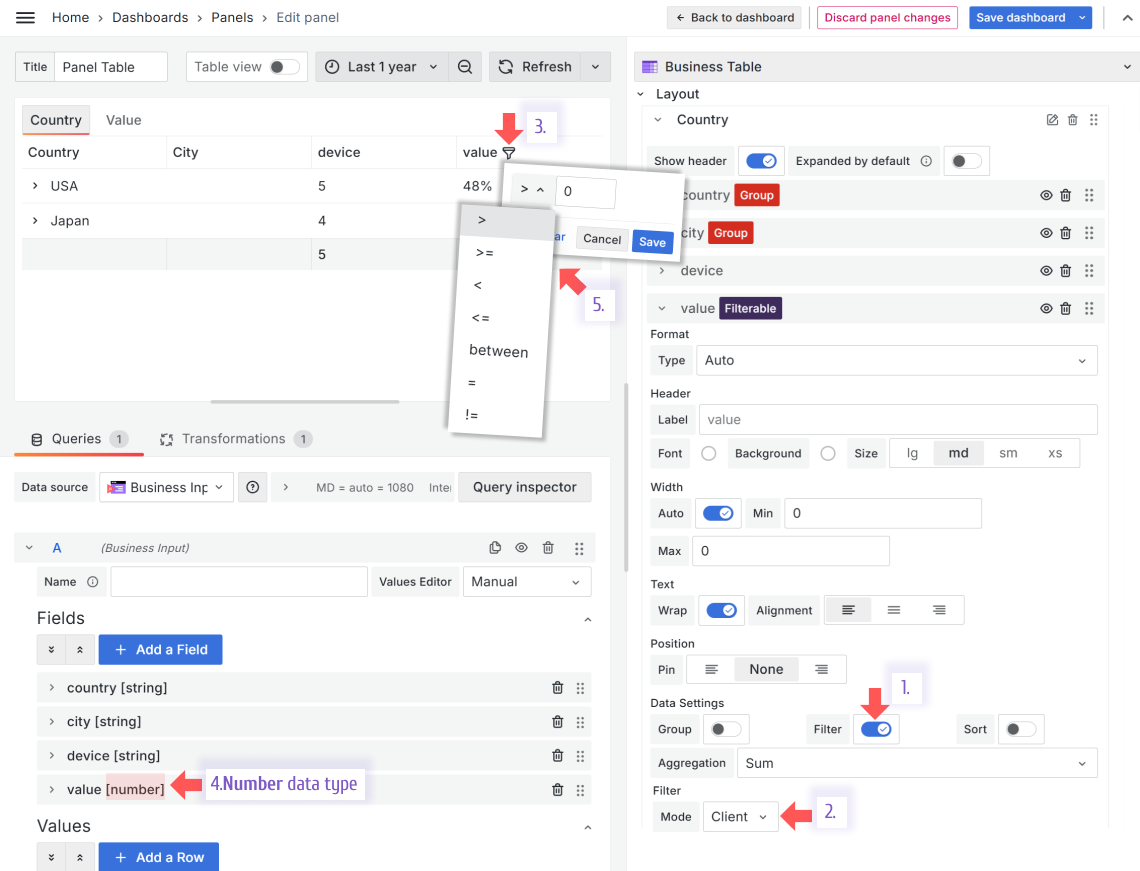
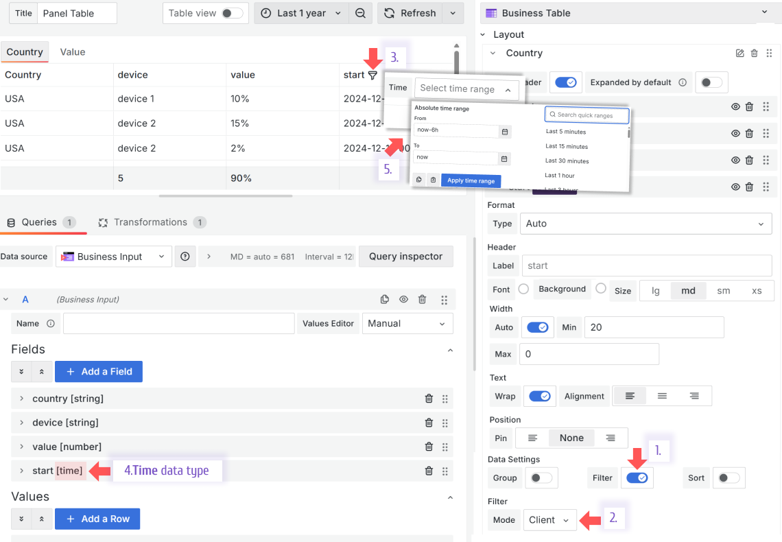
Every column of the Business Table panel offers the Filter feature. If set to Yes, the funnel icon will appear next to the column header.
With the Filter Mode->Client, when a user clicks on the funnel icon further filterimg options appear.
What those options are depends on the column data type:
- String
- Search (step 5 from the image below). It provides a form to type free text or enter a number value to use in the filtering.
- Options (step 6 from the image below). It provides a multi-select list of all existing values in the column.
- Number
Select from a list of mathematical operations and specify a number to apply it towards.
- Time
Select a time range using a standard Grafana range picker.
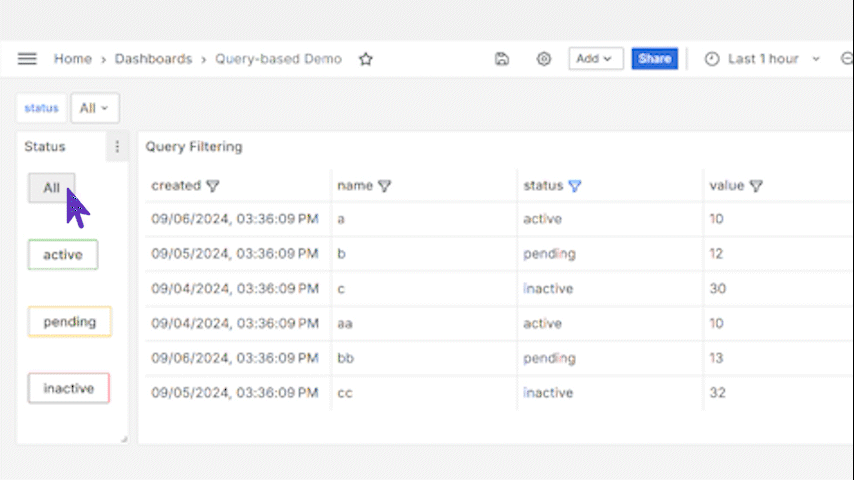
Query
This method of filtering allows panel interconnectivity or use in the data links. With the Filter Mode->Query, the displayed data is filtered according to the selected dashboard variables.
Below is how you can configure the Query filtering method.
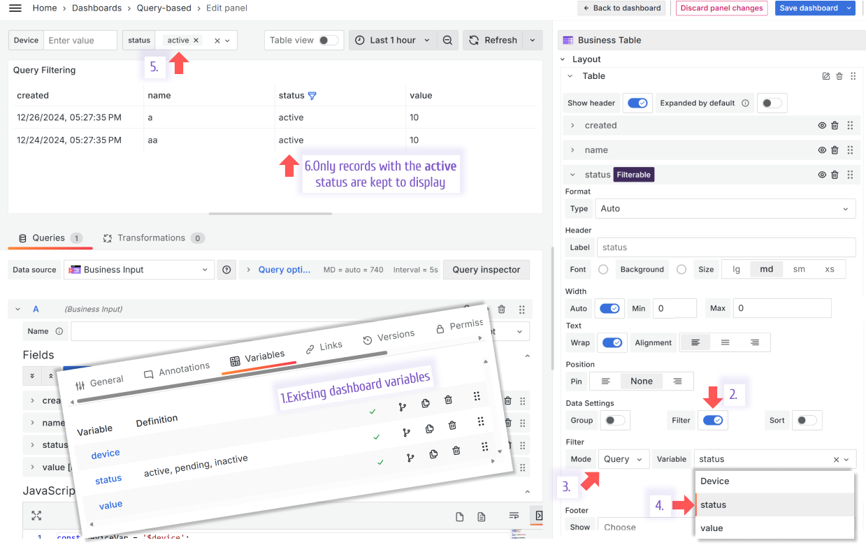
In this example, two panels are working together (panel interconnectivity). A user selects a value on the Business Variable panel, changing the status displayed in the Business Table panel.
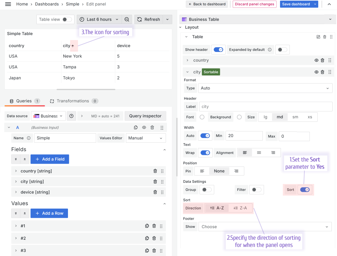
Sorting
Every column of the Business Table panel has the Sort property. Set it to Yes and then specify the default sorting order - ascending or descending. The sorting icon appears next to the column header. The order changes to the opposite after the user clicks on the icon.
Pin Columns
It is a helpful feature for the wide tables. You can pin any column to always stay visible on the left or right.
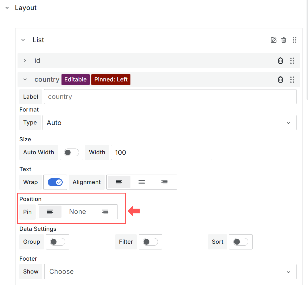
Below, the column Country is pinned to the left.
Show and hide columns
The feature is supported starting from version 1.5.0
This feature allows you to hide/show any column in your Business Table visualization. It is helpful when you need to experiment with the table's visual aspects without removing the column (and all its configuration) to get an idea of what the visualization would look like without it.
Also, the column might be required for the underlying logic but not designed for the end user.
Option to hide the table header
Option to hide the table header is supported starting from the Business table 1.9.0
You can hide the Business Table header from the dashboard by turning off the Layout->Show header switch.
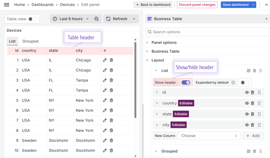
The plus icon (the button to add a row) is also hidden if you hide a table header. That means if you need a user to have the ability to add a row, keep the table header visible.