Data Sources
The Business Charts panel supports various data sources that you can use to query data for building charts.
The following code snippet demonstrates how you can retrieve data from your data source to use in the Business Charts panel.
context.panel.data.series.map((s) => {
  if (s.refId === "logo") {
    images = s.fields.find((f) => f.name === "body").values;
  } else if (s.refId === "connections") {
    sources = s.fields.find((f) => f.name === "source").values;
    targets = s.fields.find((f) => f.name === "target").values;
  } else if (s.refId === "nodes") {
    titles = s.fields.find((f) => f.name === "title").values;
    descriptions = s.fields.find((f) => f.name === "description").values;
  }
});
- You can use the
.map()and.find()JavaScript functions. - The
refIdquery retrieves data from a data source. By default, the assigned names look likeA,B, and so on. The code above works with the three querieslogo,connections, andnodes. nameis the name of the data frame column. The code above references thebody,source,target,title, anddescriptioncolumns.- To work with Grafana 9 and its older versions, you need to use the
values.bufferinstead ofvalues.
Array of Arrays
You can convert one-dimensional arrays with data into multi-dimensional arrays if needed.
- Fetch values for each field.
- Combine an array into an array of arrays.
- Use as
series[0]to access the first query,series[1]to access the second query, etc.
const series = context.panel.data.series.map((s) => {
  const rates = s.fields.find((f) => f.name === "Rate").values;
  const calls = s.fields.find((f) => f.name === "Calls").values;
  const names = s.fields.find((f) => f.name === "Name").values;

  return rates.map((d, i) => [d, calls[i], names[i]]);
})[0];
Pie Chart using Visual mode
We use the Business Input data source for this example.
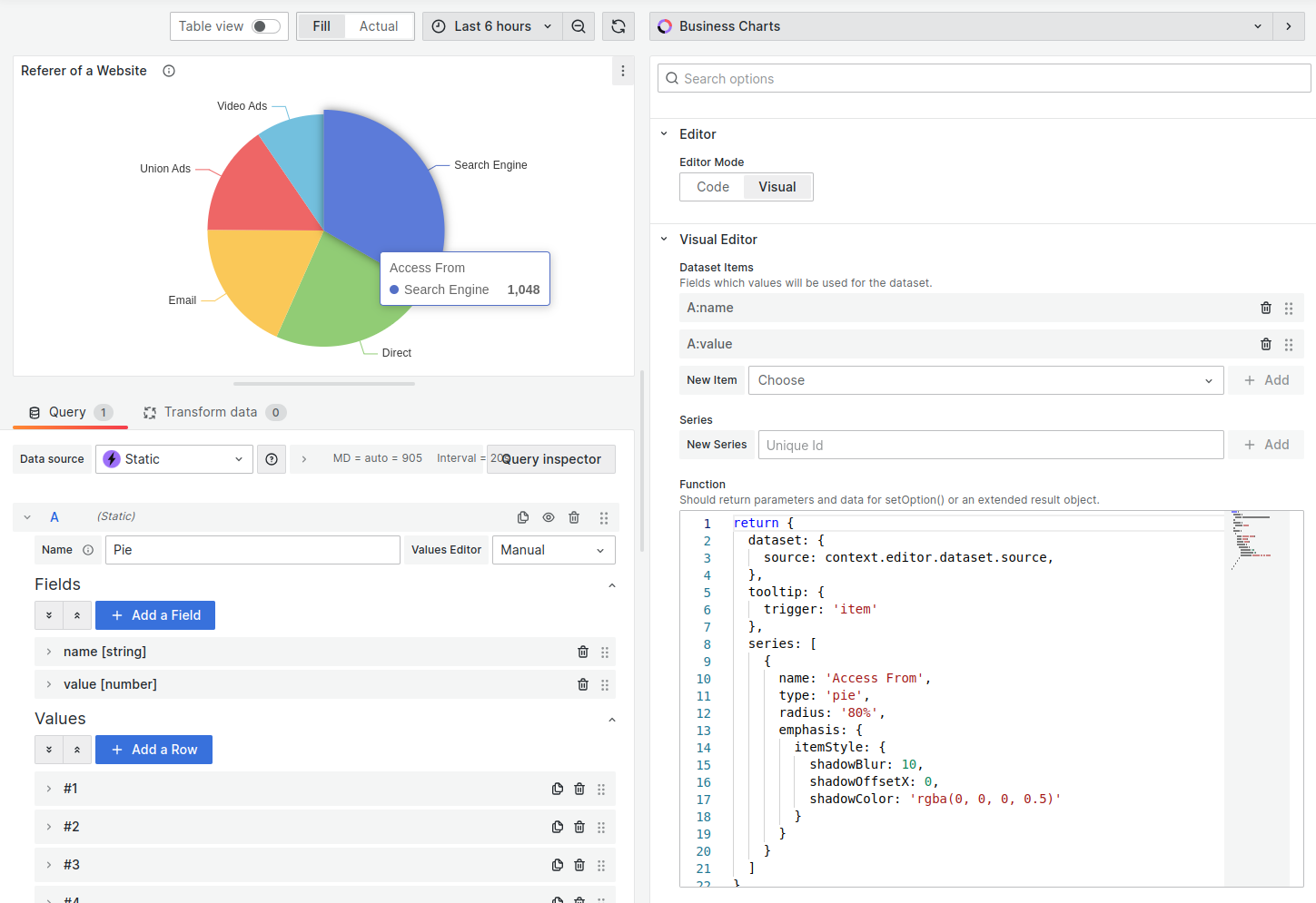
Example
return {
  dataset: {
    source: context.editor.dataset.source,
  },
  tooltip: {
    trigger: "item",
  },
  series: [
    {
      name: "Access From",
      type: "pie",
      radius: "80%",
      emphasis: {
        itemStyle: {
          shadowBlur: 10,
          shadowOffsetX: 0,
          shadowColor: "rgba(0, 0, 0, 0.5)",
        },
      },
    },
  ],
};
Wind Speed
The wind speed visualization is one of the advanced examples of what the Business Charts panel can do.
- Every data point is displayed with a custom arrow.
- The arrow color indicates the speed.
- The direction where the arrow points indicates the wind direction.
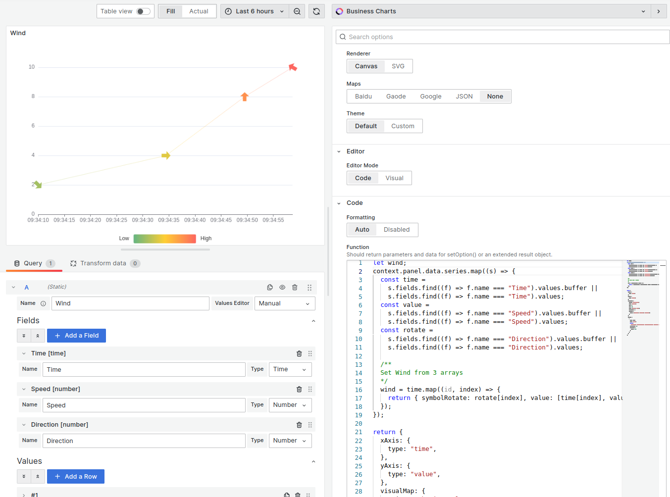
Example
let wind;
context.panel.data.series.map((s) => {
  const time = s.fields.find((f) => f.name === "Time").values;
  const value = s.fields.find((f) => f.name === "Speed").values;
  const rotate = s.fields.find((f) => f.name === "Direction").values;

  /**
  Set Wind from 3 arrays
  */
  wind = time.map((id, index) => {
    return { symbolRotate: rotate[index], value: [time[index], value[index]] };
  });
});

return {
  xAxis: {
    type: "time",
  },
  yAxis: {
    type: "value",
  },
  visualMap: {
    orient: "horizontal",
    left: "center",
    min: 0,
    max: 10,
    text: ["High", "Low"],
    dimension: 1,
    inRange: {
      color: ["#65B581", "#FFCE34", "#FD665F"],
    },
  },
  series: [
    {
      data: wind,
      type: "line",
      symbol:
        "path://M31 24.7343L21.7917 24.7343V0L9.20826 0L9.20826 24.7343H0L15.5 45L31 24.7343Z",
      symbolSize: 20,
      lineStyle: {
        width: 0.3,
      },
    },
  ],
};
Circular Graph
We use the Business Input data source for this example.
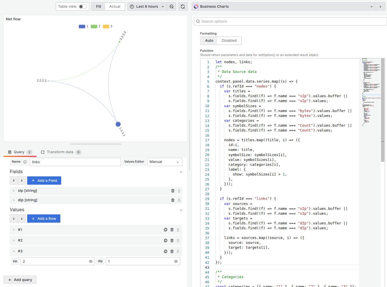
Example
let nodes, links;
/**
 * Data Source data
 */
context.panel.data.series.map((s) => {
  if (s.refId === "nodes") {
    var titles = s.fields.find((f) => f.name === "sIp").values;
    var symbolSizes = s.fields.find((f) => f.name === "bytes").values;
    var categories = s.fields.find((f) => f.name === "Count").values;

    nodes = titles.map((title, i) => ({
      id: i,
      name: title,
      symbolSize: symbolSizes[i],
      value: symbolSizes[i],
      category: categories[i],
      label: {
        show: symbolSizes[i] > 1,
      },
    }));
  }

  if (s.refId === "links") {
    var sources =
      s.fields.find((f) => f.name === "sIp").values.buffer ||
      s.fields.find((f) => f.name === "sIp").values;
    var targets =
      s.fields.find((f) => f.name === "dIp").values.buffer ||
      s.fields.find((f) => f.name === "dIp").values;

    links = sources.map((source, i) => ({
      source: source,
      target: targets[i],
    }));
  }
});

/**
 * Categories
 */
const categories = [{ name: "1" }, { name: "2" }, { name: "3" }];
return {
  tooltip: {},
  legend: [
    {
      data: categories.map((a) => a.name),
    },
  ],
  animationDurationUpdate: 1500,
  animationEasingUpdate: "quinticInOut",
  series: [
    {
      name: "Net flow",
      type: "graph",
      layout: "circular",
      circular: {
        rotateLabel: true,
      },
      data: nodes,
      links: links,
      categories: categories,
      roam: true,
      label: {
        position: "right",
        formatter: "{b}",
      },
      lineStyle: {
        color: "source",
        curveness: 0.3,
      },
    },
  ],
};