Form Elements
The Business Forms plugin is equipped with a wide variety of element types to cover almost any imaginable web application requirements.
All form elements (starting from version 4.9.0, including sections) can be created dynamically. For more info, please refer to the Dynamic Forms page of the Business Forms panel documentation.
Layout
You have a choice of three layouts - Basic, standard Buttons Only, and Sections. To switch between them open the Layout category.
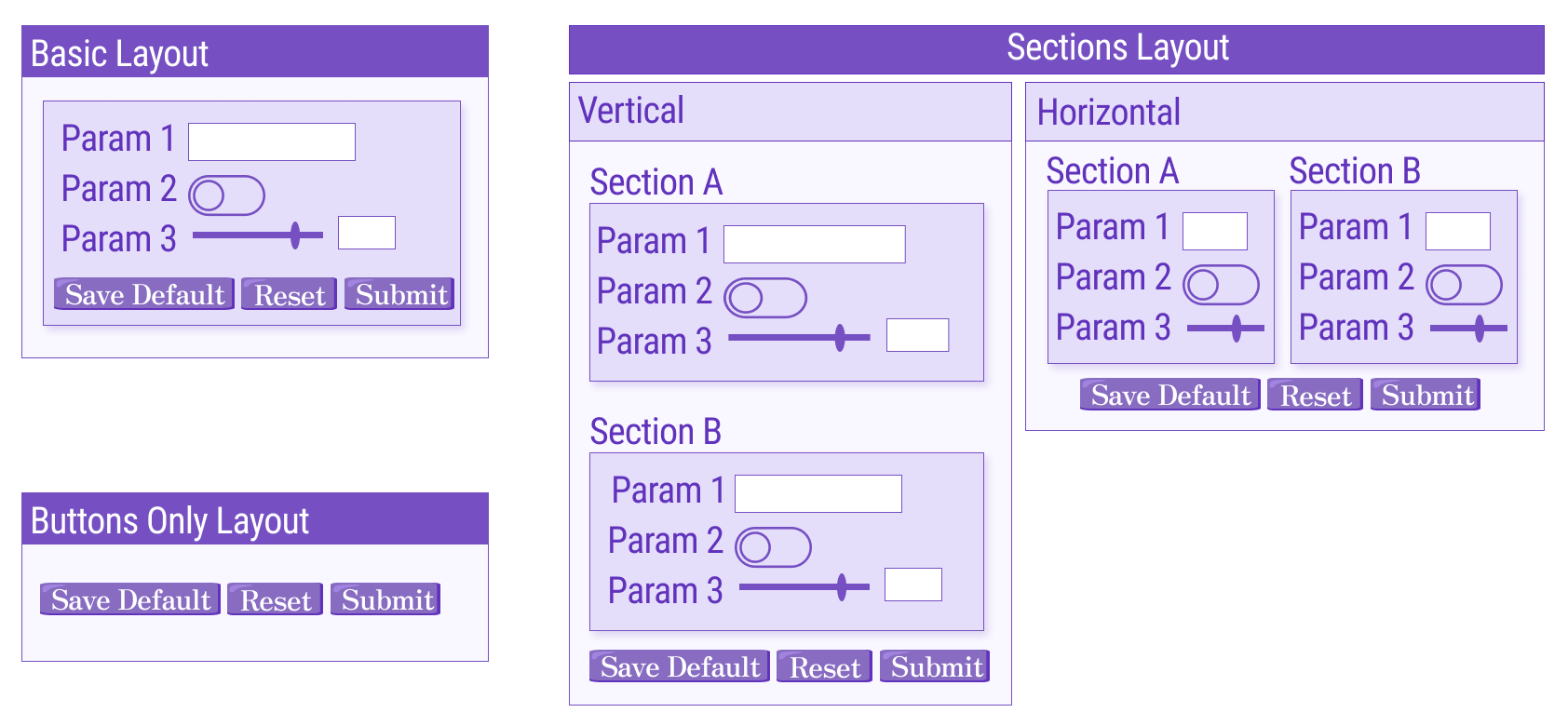
Basic
In the Basic layout, all form elements are positioned vertically, one following another.
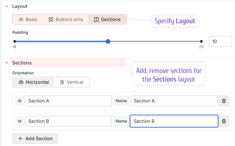
Sections
With the Sections layout, you can create as many sections as needed and place sections either vertically or horizontally using the Orientation option.
As shown in the picture above, when the layout Sections is chosen, the controls to create sections appear. For every section you can specify an ID, to use for referencing later, and a name which will be a displayed as a section label.
The Collapsable parameter has been supported starting from version 4.0.0.
Sections can be collapsible. This functionality is available only for the sections in the Vertical orientation. You can make any section Expanded for the form opening/refresh.
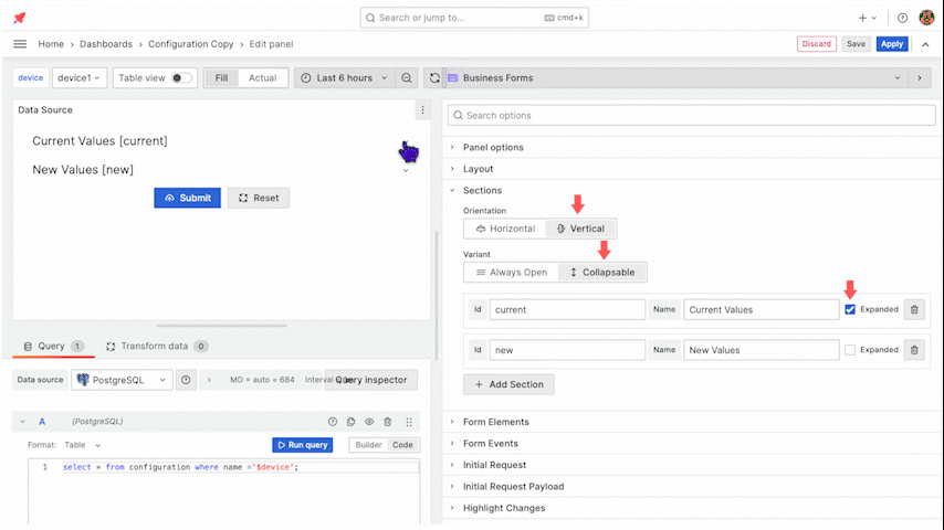
In addition, you can control the Expanded and Collapsed states in the Custom code using the following commands:
context.panel.expandSection(id);
context.panel.collapseSection(id);
The full list of the Business Form panel parameters can be found in the Custom Code section of the panel's documentation.
Buttons Only
The standard Buttons Only, as the name implies, keeps only standard buttons on your form. The standard buttons include Submit, Reset, and Save default. With this layout, all panel options related to other form elements are hidden, which gives a cleaner Edit mode to work with.
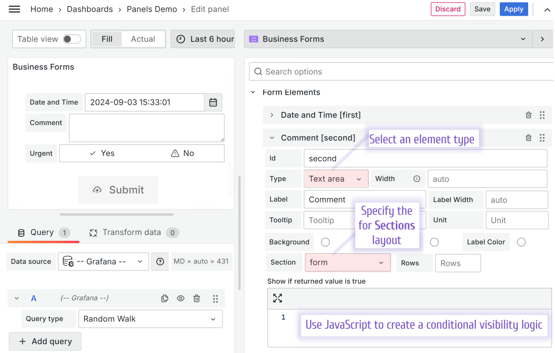
Add a form element
Go to the Form Elements category to add a form element. Start by specifying ID, label, and type. After you click the Add Element button, more element options are available to configure.
Element types have specific options. For instance, the Text area type has Rows to regulate the element size on the dashboard.
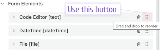
Move a form element
Supported starting from the version 3.0.0.
You can drag-and-drop form elements in the edit mode to change their order on the form.
Form element types
The picture below illustrates all available element types prior to the version 4.4.0
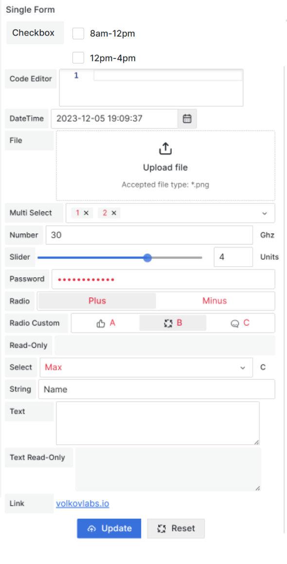
Custom buttonCheckbox List with custom optionsCode EditorColor PickerDateDate and TimeFileLinkMulti-select with custom optionsNumber InputNumber SliderPassword InputRadio Group with boolean optionsRadio Group with custom optionsRead-onlyRead-only Text AreaString InputSelect with Custom optionsText AreaTime
Common configuration
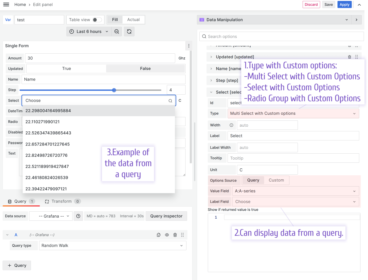
There are three form elements with select options.
- Multi Select with Custom Options
- Select with Custom Options
- Radio Group with Custom Options
All three have some options in common.
Icon
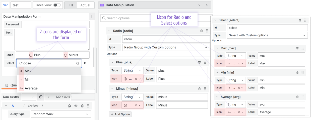
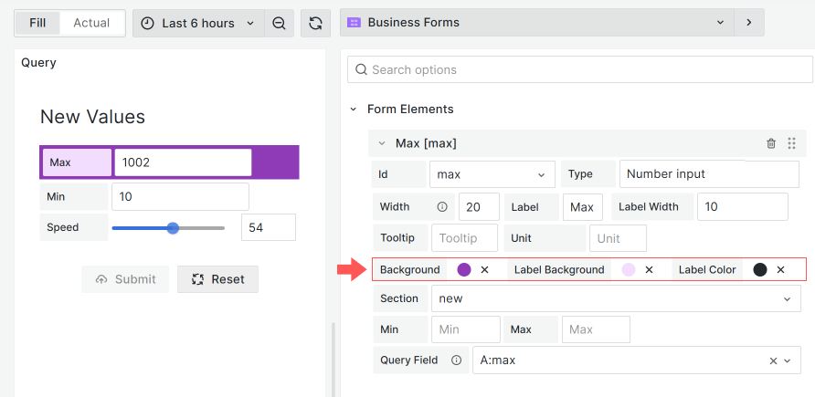
Custom color/background color for elements
Colors for elements supported starting from version 4.0.0.
You can play with Form Elements colors. Configurable are:
- Background color,
- Label background,
- Label color.
Select Options from Query
Below is supported starting from the version 3.2.1.
Reference a query from any configured data source to populate form elements dynamically. You can specify the Label and Value fields.
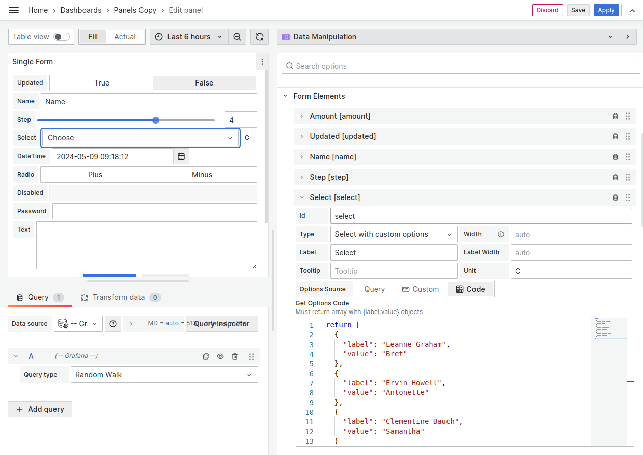
Select Options from Get Options Code
Below is supported starting from the version 3.5.0.
Get Options Code allows to hard code options using the code editor. The code must:
- return array with
{label,value}objects, - be synchronous.
Set Options received asynchronously
The Get Options Code does not support asynchronous code. However, you still can work with options received asynchronously.
It could be done in two steps:
Step 1. Initial Request.
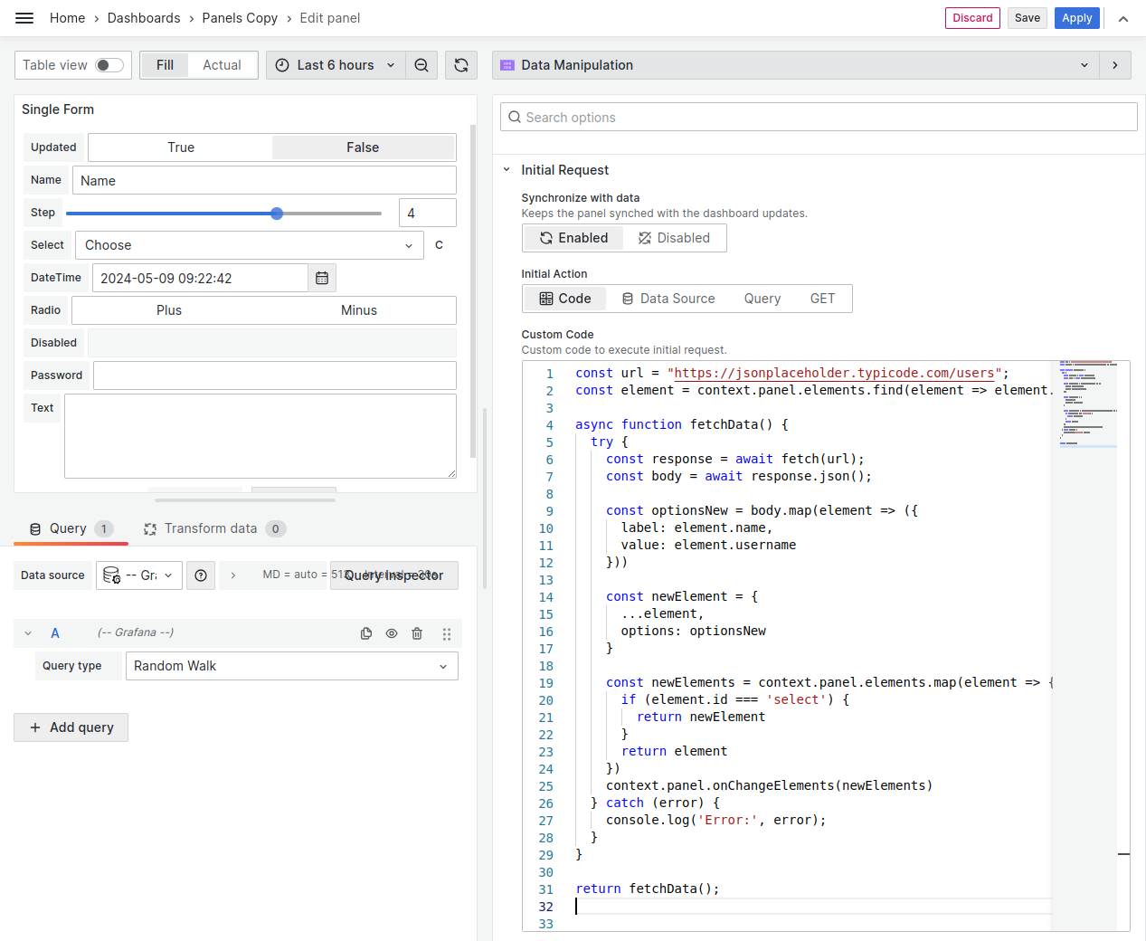
In the example below, we find a necessary element and update its options. Once the data has been received, we update the element using context.panel.onChangeElements().
const url = "https://jsonplaceholder.typicode.com/users";
const element = context.panel.elements.find(
  (element) => element.id === "select"
);

async function fetchData() {
  try {
    const response = await fetch(url);
    const body = await response.json();

    const optionsNew = body.map((element) => ({
      label: element.name,
      value: element.username,
    }));

    const newElement = {
      ...element,
      options: optionsNew,
    };
    const newElements = context.panel.elements.map((element) => {
      if (element.id === "select") {
        return newElement;
      }
      return element;
    });
    context.panel.onChangeElements(newElements);
  } catch (error) {
    console.log("Error:", error);
  }
}

return fetchData();
Step 2. Create the GET Options Code
Set options for your element from context.panel.elements.
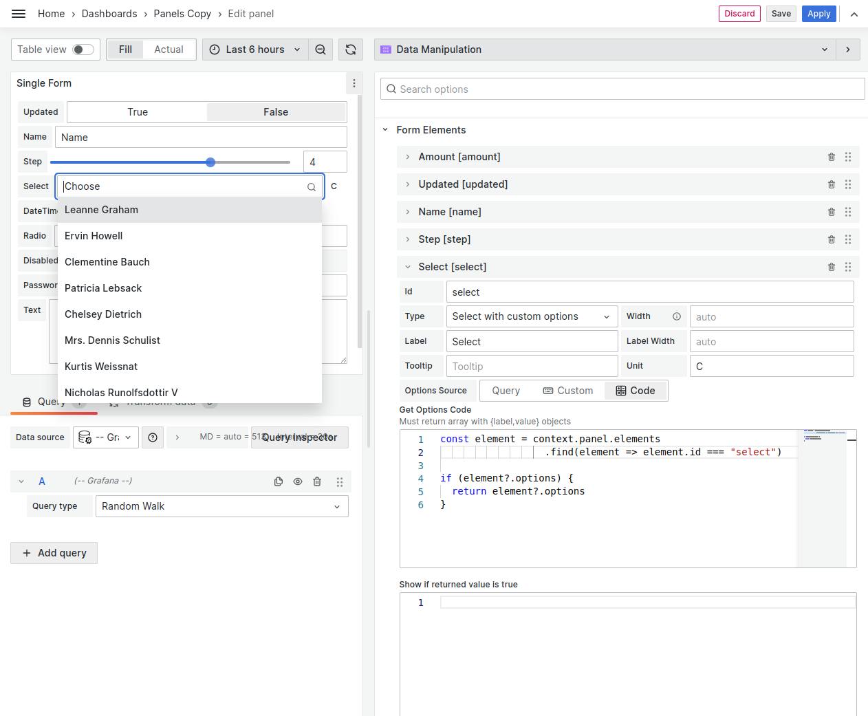
const element = context.panel.elements.find(
  (element) => element.id === "select"
);

if (element?.options) {
  return element?.options;
}
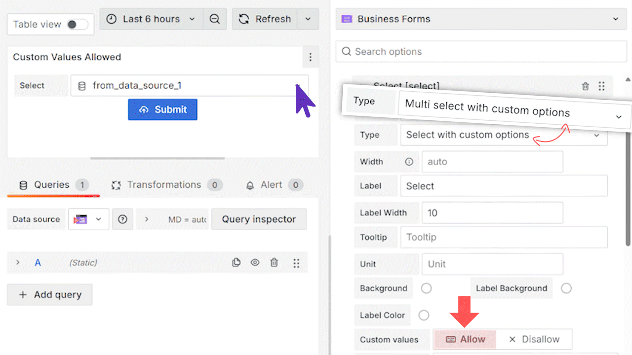
Custom Values
Available starting from version 4.9.0.
If allowed, users can enter custom values into the Select and Multi select form element types
Conditional Visibility
Every form element has the Show If returned value is true parameter where you enter JavaScript code.
- If this code returns
true, the element is shown on the panel. - If this code returns
false, the element is hidden from the panel.
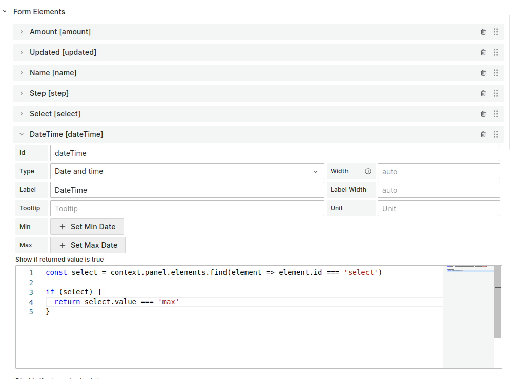
Example code to check the current value of the select element and show the dateTime element if the value equal to max:
const select = context.panel.elements.find(
  (element) => element.id === "select"
);

if (select) {
  return select.value === "max";
}
Below is supported starting from the version 3.2.1.
You can use the dashboard and global variables within your JavaScript code.
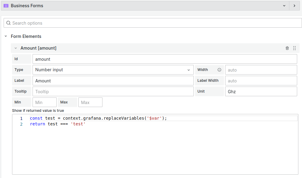
Example code to check the value of the dashboard variable var:
const test = context.grafana.replaceVariables("$var");
return test === "test";
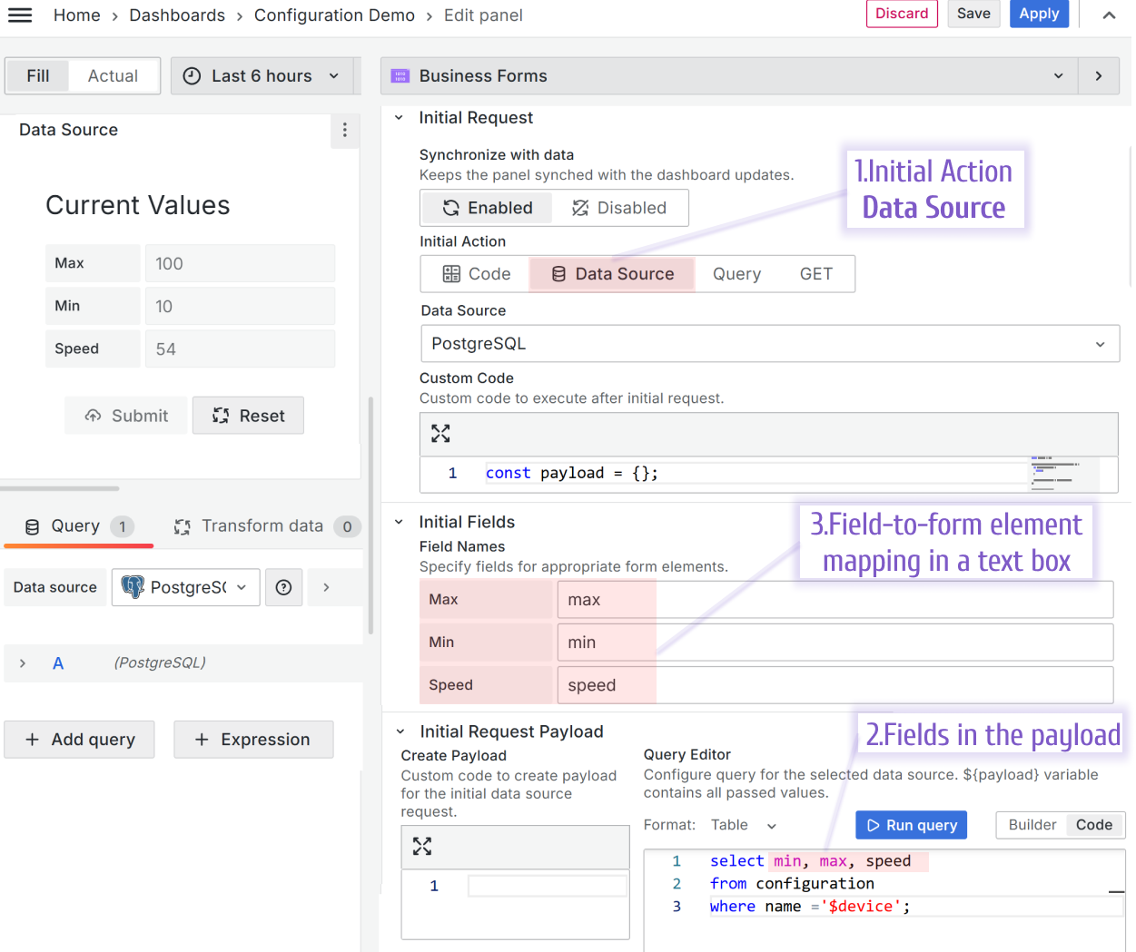
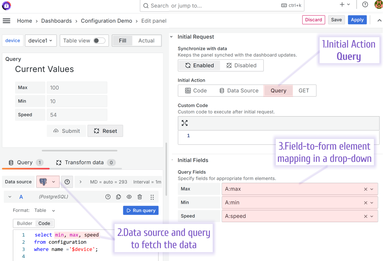
Field Mapping
Below is supported starting from 4.4.0
To map the Initial Form Elements values, use the Initial Fields options category.
Data source 4.4.0
Query 4.4.0
Below is supported starting from version 3.2.1 to version 4.0.0
Using the Field name parameter for Data Source and the Query Field for Query, you can specify field-to-form mapping.
Data Source
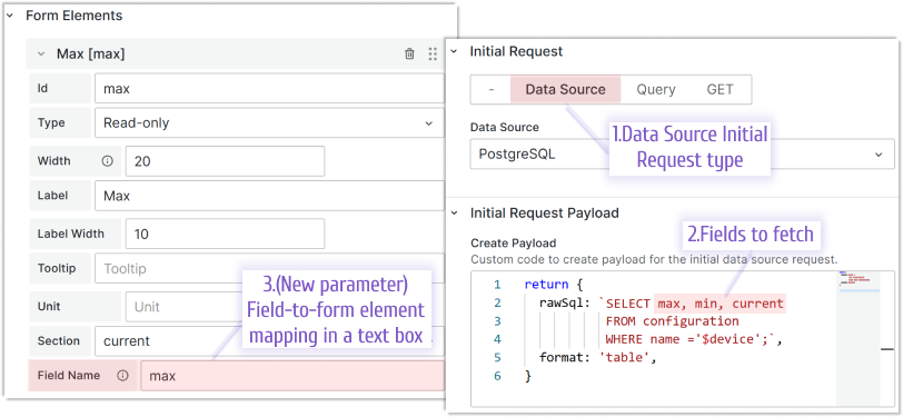
The Field Name option for each Form Element is located under the code editor when the data source option is enabled. Specify a field name for appropriate form element from the data source response.
Query
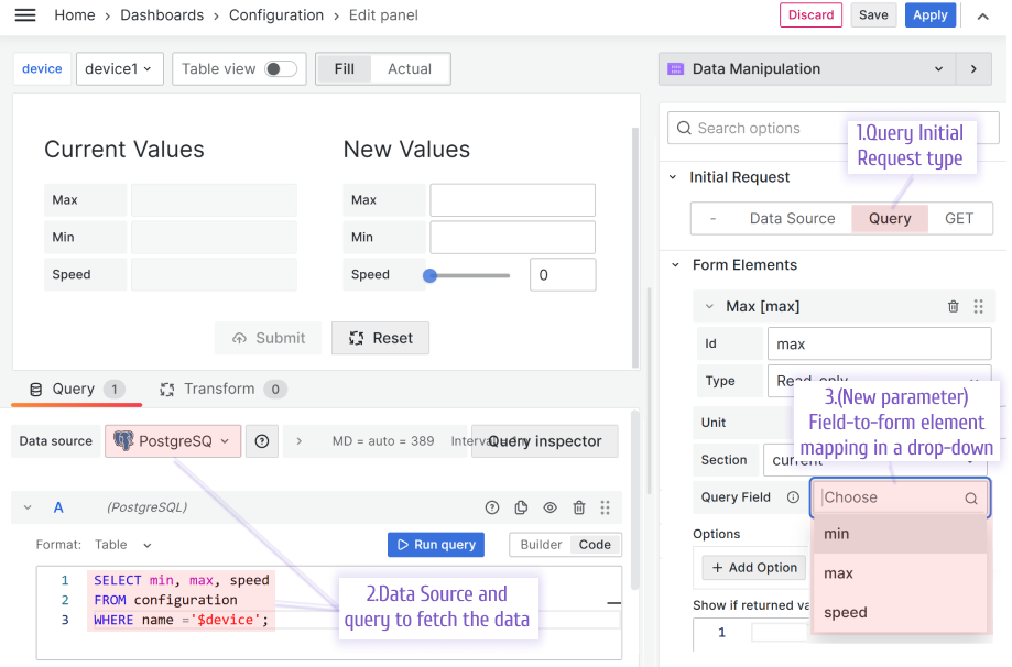
The Query Field option for each Form Element is located under the code editor when the Query option is enabled. Specify a field name for appropriate form element from the Query response.