Display mode
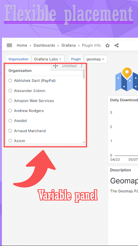
The Business Variable panel enhances dashboard variables by making them more user-friendly and allowing to place the panel anywhere on the dashboard.
The Business Variable panel configuration starts with the Display mode parameter. With that, you determine the style and, consequently, other available parameters for configuration.
As of now, there are four available options for the Display Mode parameter.
Version
The Business Variable panel supports the Slider display mode starting from version 3.0.0.
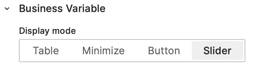
Follow the links below to learn more about each display mode.
| Section | Description |
|---|---|
| Table | From simple lists to elaborated TreeViews |
| Minimize | Minimalistic design, similar to the native dashboard variables |
| Button | The choice looks like a set of on/off buttons |
| Slider | Laconic slider for a simple one-value choice |