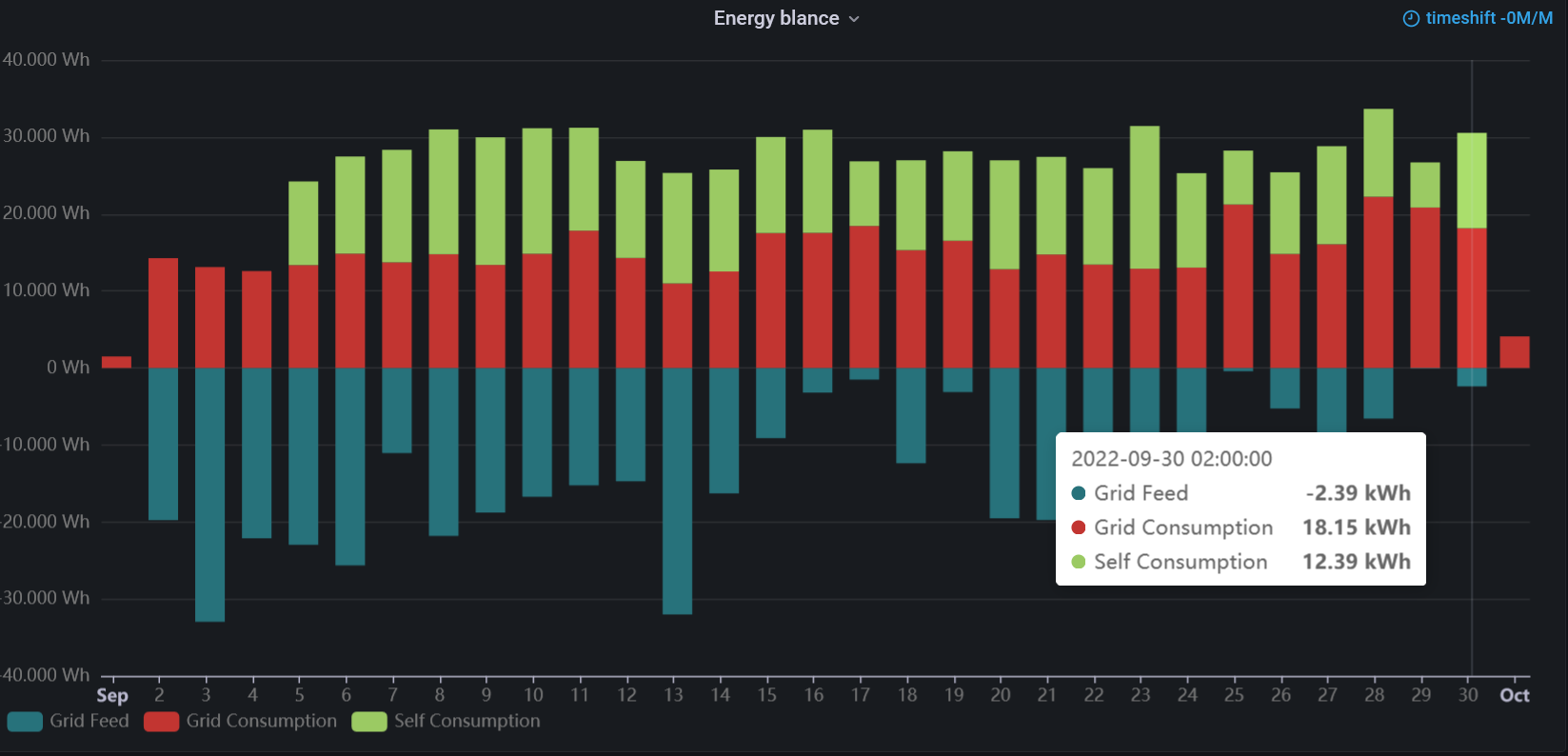
Create Stacked Bars using the Apache ECharts visualization panel

Sineos opened an issue in the Apache ECharts repository asking for help with Stacked Bar Graph:
"I have three queries returning aggregated monthly values, which I would like to display as a Stacked bar graph. Turning it into a simple bar graph works but dividing the data too differently styled bars just ends up with errors."
The issue was successfully resolved, and Sineos created this example and attached
- Apache ECharts function,
- InfluxDB queries to retrieve data,
- Ready-to-go Dashboard using the Static Data Source.
InfluxDB Data Source
createEmpty: truemakes sure that the data of the individual bar segments stay aligned when data is missing in the series.set(key: "Source", value: "Self Consumption")manipulates the field used for naming the series.
Query A
from(bucket: "home")
  |>  range(start: v.timeRangeStart, stop: v.timeRangeStop)
  |>  filter(fn: (r)  => r["_measurement"] == "vzlogger")
  |>  filter(fn: (r)  => r["Source"] == "SML_Energy_Out")
  |>  filter(fn: (r)  => r["_field"] == "Energy")
  |>  aggregateWindow(every: 1d, fn: sum, createEmpty: true)
  |>  set(key: "Source",  value: "Grid Feed")
Query B
from(bucket: "home")
  |>  range(start: v.timeRangeStart, stop: v.timeRangeStop)
  |>  filter(fn: (r)  => r["_measurement"] == "vzlogger")
  |>  filter(fn: (r)  => r["Source"] == "SML_Energy_In")
  |>  filter(fn: (r)  => r["_field"] == "Energy")
  |>  aggregateWindow(every: 1d, fn: sum, createEmpty: true)
  |>  set(key: "Source",  value: "Grid Consumption")
Query C
from(bucket: "home")
  |>  range(start: v.timeRangeStart, stop: v.timeRangeStop)
  |>  filter(fn: (r)  => r["_measurement"] == "vzlogger")
  |>  filter(fn: (r)  => r["Source"] == "SelfConsumption")
  |>  filter(fn: (r)  => r["_field"] == "Energy")
  |>  aggregateWindow(every: 1d, fn: sum, createEmpty: true)
  |>  set(key: "Source",  value: "Self Consumption")
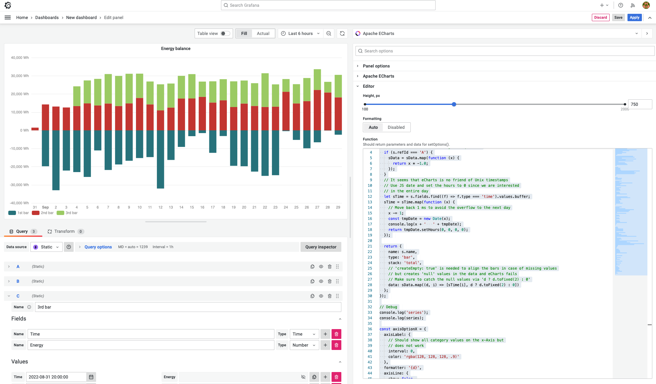
Apache ECharts function
const series = data.series.map((s) => {
  let sData = s.fields.find((f) => f.type === "number").values.buffer;

  // Move 'Grid Feed' to the negative quadrant
  if (s.refId === "A") {
    sData = sData.map(function (x) {
      return x * -1.0;
    });
  }

  // It seems that ECharts is no friend of Unix timestamps
  // Use JS date and set the hours to 0 since we are interested
  // in the entire day
  let sTime = s.fields.find((f) => f.type === "time").values.buffer;
  sTime = sTime.map(function (x) {
    // Move back 1 ms to avoid the overflow to the next day
    x -= 1;
    const tmpDate = new Date(x);
    return tmpDate.setHours(0, 0, 0, 0);
  });

  return {
    name: s.fields[1].labels.Source,
    type: "bar",
    stack: "total",
    // 'createEmpty: true' is needed to align the bars in case of missing values
    // but creates 'null' values in the data and eCharts fails
    // Make sure to catch the null values via 'd ? d.toFixed(2) : 0'
    data: sData.map((d, i) => [sTime[i], d ? d.toFixed(2) : 0]),
  };
});

// Debug
//console.log('series');
//console.log(series);

const axisOptionX = {
  axisLabel: {
    // Should show all category values on the x-Axis but
    // does not work
    interval: 0,
    color: "rgba(128, 128, 128, .9)",
  },
  formatter: "{d}",
  axisLine: {
    show: false,
    onZero: false,
  },
  splitLine: {
    lineStyle: {
      color: "rgba(128, 128, 128, .2)",
    },
  },
  // Work around the 'interval: 0' issue
  // Potentially causes issues for low data count
  splitNumber: 31,
  boundaryGap: true,
  axisTick: {
    show: false,
    interval: 0,
    alignWithLabel: true,
  },
};

const axisOptionY = {
  axisLabel: {
    formatter: function (value) {
      // 'toLocaleString' applies internationalization to the
      // number format, e.g. thousands separator
      return value.toLocaleString() + " Wh";
    },
    color: "rgba(128, 128, 128, .9)",
  },
  axisTick: {
    show: false,
  },
  axisLine: {
    show: false,
  },
  splitLine: {
    lineStyle: {
      color: "rgba(128, 128, 128, .2)",
    },
  },
};

return {
  color: [
    "#27727b", // Series A
    "#c23531", // Series B
    "#9bca63", // Series C
  ],
  backgroundColor: "transparent",
  tooltip: {
    trigger: "axis",
    valueFormatter: function (value) {
      return (value / 1000.0).toFixed(2).toLocaleString() + " kWh";
    },
    axisPointer: {
      type: "shadow",
      label: {
        // For whatever reason axisPointer.label sets the tooltip "heading"
        formatter: function (params) {
          const tmpDate = new Date(params.value);
          const options = {
            weekday: "long",
            year: "numeric",
            month: "long",
            day: "numeric",
          };
          return tmpDate.toLocaleDateString("en-EN", options);
        },
      },
    },
  },
  legend: {
    left: "0",
    bottom: "0",
    textStyle: {
      color: "rgba(128, 128, 128, .9)",
    },
  },
  xAxis: Object.assign(
    {
      type: "time",
    },
    axisOptionX
  ),
  yAxis: Object.assign(
    {
      type: "value",
    },
    axisOptionY
  ),
  grid: {
    left: 10,
    right: 10,
    top: 6,
    bottom: 24,
    containLabel: true,
  },
  series,
};
Dashboard to Try
The following dashboard is a ready-to-go example that can be imported into Grafana as JSON. It requires
- Business Input data source
- Apache ECharts visualization panel plugin.
Make sure to install the Static data source via the Plugins Configuration and then add it to the Data Sources.
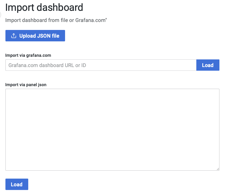
Import dashboard
Once the Static data source is installed and added and the Apache ECharts visualization panel is installed, go to the Dashboard menu and select Import.
In the Import dashboard window, insert the JSON code into the Import via the panel JSON field. Copy the JSON code from below.
Specify the dashboard name and Static data source, and click Import.
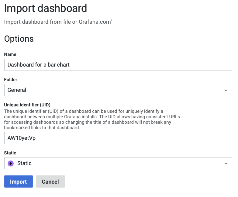
You should see the visualization working right away.
Dashboard
{
  "__inputs": [
    {
      "name": "DS_STATIC",
      "label": "Static",
      "description": "",
      "type": "datasource",
      "pluginId": "marcusolsson-static-datasource",
      "pluginName": "Static"
    }
  ],
  "__elements": {},
  "__requires": [
    {
      "type": "grafana",
      "id": "grafana",
      "name": "Grafana",
      "version": "9.3.2"
    },
    {
      "type": "datasource",
      "id": "marcusolsson-static-datasource",
      "name": "Static",
      "version": "2.1.0"
    },
    {
      "type": "panel",
      "id": "volkovlabs-echarts-panel",
      "name": "Apache ECharts",
      "version": "4.0.0"
    }
  ],
  "annotations": {
    "list": [
      {
        "builtIn": 1,
        "datasource": {
          "type": "grafana",
          "uid": "-- Grafana --"
        },
        "enable": true,
        "hide": true,
        "iconColor": "rgba(0, 211, 255, 1)",
        "name": "Annotations & Alerts",
        "target": {
          "limit": 100,
          "matchAny": false,
          "tags": [],
          "type": "dashboard"
        },
        "type": "dashboard"
      }
    ]
  },
  "editable": true,
  "fiscalYearStartMonth": 0,
  "graphTooltip": 0,
  "id": null,
  "links": [],
  "liveNow": false,
  "panels": [
    {
      "datasource": {
        "type": "marcusolsson-static-datasource",
        "uid": "${DS_STATIC}"
      },
      "description": "",
      "gridPos": {
        "h": 23,
        "w": 24,
        "x": 0,
        "y": 0
      },
      "hideTimeOverride": false,
      "id": 91,
      "interval": "1h",
      "links": [],
      "options": {
        "baidu": {
          "callback": "bmapReady",
          "key": ""
        },
        "editor": {
          "format": "auto",
          "height": 600
        },
        "gaode": {
          "key": "",
          "plugin": "AMap.Scale,AMap.ToolBar"
        },
        "getOption": "const series = data.series.map((s) => {\n  let sData = s.fields.find((f) => f.type === 'number').values.buffer;\n  // Move 'Grid Feed' to the negative quadrant\n  if (s.refId === 'A') {\n    sData = sData.map(function (x) {\n      return x * -1.0;\n    });\n  }\n  // It seems that eCharts is no friend of Unix timestamps\n  // Use JS date and set the hours to 0 since we are interested\n  // in the entire day\n  let sTime = s.fields.find((f) => f.type === 'time').values.buffer;\n  sTime = sTime.map(function (x) {\n    // Move back 1 ms to avoid the overflow to the next day\n    x -= 1;\n    const tmpDate = new Date(x);\n    console.log(x + '   ' + tmpDate);\n    return tmpDate.setHours(0, 0, 0, 0);\n  });\n\n  return {\n    name: s.name,\n    type: 'bar',\n    stack: 'total',\n    // 'createEmpty: true' is needed to align the bars in case of missing values\n    // but creates 'null' values in the data and eCharts fails\n    // Make sure to catch the null values via 'd ? d.toFixed(2) : 0'\n    data: sData.map((d, i) => [sTime[i], d ? d.toFixed(2) : 0])\n  };\n});\n\n// Debug\nconsole.log('series');\nconsole.log(series);\n\nconst axisOptionX = {\n  axisLabel: {\n    // Should show all category values on the x-Axis but\n    // does not work\n    interval: 0,\n    color: 'rgba(128, 128, 128, .9)'\n  },\n  formatter: '{d}',\n  axisLine: {\n    show: false,\n    onZero: false\n  },\n  splitLine: {\n    lineStyle: {\n      color: 'rgba(128, 128, 128, .2)'\n    }\n  },\n  // Work around the 'interval: 0' issue\n  // Potentially causes issues for low data count\n  splitNumber: 31,\n  boundaryGap: true,\n  axisTick: {\n    show: false,\n    interval: 0,\n    alignWithLabel: true\n  }\n};\n\nconst axisOptionY = {\n  axisLabel: {\n    formatter: function (value) {\n      // 'toLocaleString' applies internationalization to the\n      // number format, e.g. thousands separator\n      return value.toLocaleString() + ' Wh';\n    },\n    color: 'rgba(128, 128, 128, .9)'\n  },\n  axisTick: {\n    show: false\n  },\n  axisLine: {\n    show: false\n  },\n  splitLine: {\n    lineStyle: {\n      color: 'rgba(128, 128, 128, .2)'\n    }\n  }\n};\n\nreturn {\n  color: [\n    '#27727b', // Series A\n    '#c23531', // Series B\n    '#9bca63'  // Series C\n  ],\n  backgroundColor: 'transparent',\n  tooltip: {\n    trigger: 'axis',\n    valueFormatter: function (value) {\n      return ((value / 1000.0).toFixed(2)).toLocaleString() + ' kWh';\n    },\n    axisPointer: {\n      type: 'shadow',\n      label: {\n        // For whatever reason axisPointer.label sets the tooltip \"heading\"\n        formatter: function (params) {\n          const tmpDate = new Date(params.value);\n          const options = { weekday: 'long', year: 'numeric', month: 'long', day: 'numeric' };\n          return tmpDate.toLocaleDateString('en-EN', options);\n        }\n      }\n    }\n  },\n  legend: {\n    left: '0',\n    bottom: '0',\n    textStyle: {\n      color: 'rgba(128, 128, 128, .9)'\n    }\n  },\n  xAxis: Object.assign(\n    {\n      type: 'time'\n    },\n    axisOptionX\n  ),\n  yAxis: Object.assign(\n    {\n      type: 'value'\n    },\n    axisOptionY\n  ),\n  grid: {\n    left: 10,\n    right: 10,\n    top: 6,\n    bottom: 24,\n    containLabel: true\n  },\n  series\n};\n",
        "google": {
          "callback": "gmapReady",
          "key": ""
        },
        "map": "none",
        "renderer": "canvas"
      },
      "pluginVersion": "9.1.2",
      "targets": [
        {
          "datasource": {
            "type": "marcusolsson-static-datasource",
            "uid": "${DS_STATIC}"
          },
          "frame": {
            "fields": [
              {
                "config": {},
                "name": "Time",
                "type": "time",
                "values": [
                  1661990400000, 1662076800000, 1662163200000, 1662249600000,
                  1662336000000, 1662422400000, 1662508800000, 1662595200000,
                  1662681600000, 1662768000000, 1662854400000, 1662940800000,
                  1663027200000, 1663113600000, 1663200000000, 1663286400000,
                  1663372800000, 1663459200000, 1663545600000, 1663632000000,
                  1663718400000, 1663804800000, 1663891200000, 1663977600000,
                  1664064000000, 1664150400000, 1664236800000, 1664323200000,
                  1664409600000, 1664496000000
                ]
              },
              {
                "config": {},
                "name": "Energy",
                "type": "number",
                "values": [
                  0, 19753.79999999702, 32957, 22119.30000000447, 22960,
                  25633.5, 11050.79999999702, 21804, 18772, 16723.20000000298,
                  15237.39999999851, 14715.70000000298, 32009.89999999851,
                  16286.60000000149, 9106.69999999553, 3201.60000000149, 1505.5,
                  12370, 3128.2000000029802, 19515.79999999702, 19742.5,
                  22695.89999999851, 25052.20000000298, 24672.20000000298,
                  424.79999999701977, 5252.89999999851, 9866.89999999851,
                  6571.9000000059605, 93.09999999403954, 2389.4000000059605
                ]
              }
            ],
            "meta": {},
            "name": "1st bar"
          },
          "hide": false,
          "refId": "A"
        },
        {
          "datasource": {
            "type": "marcusolsson-static-datasource",
            "uid": "${DS_STATIC}"
          },
          "frame": {
            "fields": [
              {
                "config": {},
                "name": "Time",
                "type": "time",
                "values": [
                  1661990400000, 1662076800000, 1662163200000, 1662249600000,
                  1662336000000, 1662422400000, 1662508800000, 1662595200000,
                  1662681600000, 1662768000000, 1662854400000, 1662940800000,
                  1663027200000, 1663113600000, 1663200000000, 1663286400000,
                  1663372800000, 1663459200000, 1663545600000, 1663632000000,
                  1663718400000, 1663804800000, 1663891200000, 1663977600000,
                  1664064000000, 1664150400000, 1664236800000, 1664323200000,
                  1664409600000, 1664496000000
                ]
              },
              {
                "config": {},
                "name": "Energy",
                "type": "number",
                "values": [
                  1492.2999999970198, 14262, 13104.10000000149,
                  12588.39999999851, 13359.70000000298, 14840.69999999553,
                  13712.5, 14773.30000000447, 13383.10000000149,
                  14831.80000000447, 17832.09999999404, 14284.20000000298,
                  10979.10000000149, 12534.69999999553, 17521.10000000149,
                  17545.70000000298, 18443.79999999702, 15298.70000000298,
                  16523.79999999702, 12827.60000000149, 14739.20000000298,
                  13430.89999999851, 12888.29999999702, 13037.5, 21231.5,
                  14808.89999999851, 16063.40000000596, 22240.79999999702,
                  20840.79999999702, 18149.20000000298
                ]
              }
            ],
            "meta": {},
            "name": "2nd bar"
          },
          "hide": false,
          "refId": "B"
        },
        {
          "datasource": {
            "type": "marcusolsson-static-datasource",
            "uid": "${DS_STATIC}"
          },
          "frame": {
            "fields": [
              {
                "config": {},
                "name": "Time",
                "type": "time",
                "values": [
                  1661990400000, 1662076800000, 1662163200000, 1662249600000,
                  1662336000000, 1662422400000, 1662508800000, 1662595200000,
                  1662681600000, 1662768000000, 1662854400000, 1662940800000,
                  1663027200000, 1663113600000, 1663200000000, 1663286400000,
                  1663372800000, 1663459200000, 1663545600000, 1663632000000,
                  1663718400000, 1663804800000, 1663891200000, 1663977600000,
                  1664064000000, 1664150400000, 1664236800000, 1664323200000,
                  1664409600000, 1664496000000
                ]
              },
              {
                "config": {},
                "name": "Energy",
                "type": "number",
                "values": [
                  null,
                  null,
                  null,
                  null,
                  10866,
                  12626,
                  14618,
                  16210,
                  16573,
                  16310,
                  13369,
                  12607,
                  14353,
                  13236,
                  12482,
                  13399,
                  8394,
                  11679,
                  11626,
                  14140,
                  12683,
                  12524,
                  18538,
                  12263,
                  6997,
                  10605,
                  12742,
                  11412,
                  5856,
                  12390
                ]
              }
            ],
            "meta": {},
            "name": "3rd bar"
          },
          "hide": false,
          "refId": "C"
        }
      ],
      "title": "Energy balance",
      "type": "volkovlabs-echarts-panel"
    }
  ],
  "schemaVersion": 37,
  "style": "dark",
  "tags": [],
  "templating": {
    "list": []
  },
  "time": {
    "from": "now-6h",
    "to": "now"
  },
  "timepicker": {},
  "timezone": "",
  "title": "New dashboard",
  "uid": "AW10yetVk",
  "version": 3,
  "weekStart": ""
}
Any feedback and comments are welcome. Feel free to challenge us with your questions. It helps us to stay sharp!