The missing plugin to create business and industrial charts in Grafana


Grafana is without a doubt one of the best analytics and data visualization platforms, with a wide range of chart panels and a long list of community plugins like Plotly. Nonetheless, none of them can compete with the flexibility of Apache ECharts.
Apache ECharts is a free but powerful charting and visualization library that allows you to create intuitive, interactive, and highly customizable charts in a matter of minutes. It is written entirely in JavaScript and is based on the zrender library.

Business Charts panel is a plugin for Grafana that allows you to integrate the Apache ECharts library and its unlimited capabilities into your Grafana dashboard. The original plugin was developed for Grafana 6.3 and 7.0 and was based on Apache ECharts 4.9.0. It hasn't been updated since then.
Volkov Labs adapted and upgraded it based on the most recent Grafana 9 with the integration of Apache ECharts 5.3.3, which allowed adding new features such as Monaco Code Editor and support for SVG and Canvas renderers.
You can install Business Charts panel from the Grafana Plugins catalog (Plugins Configuration menu). Alternatively, you can set up it manually by downloading from GitHub.
Apache ECharts
The Apache ECharts library is a powerful and robust data visualization solution. To get started with building visually appealing and insightful data visualizations, you do not need to be a senior JavaScript developer. Furthermore, if your use case is pretty unique, Apache ECharts is a perfect tool for developing visualizations of any complexity and scale.
Business Charts panel for Grafana is a much-anticipated bridge that has now become available. You can combine the top-notch advantages of two outstanding open source solutions, Grafana and Apache ECharts, into a single solution tailored to your specific requirements.
According to the press release
"Apache ECharts is in use at Alibaba, Amazon, Baidu, GitLab, Intel, and Tencent, among others, as well as solutions such as Apache Superset data visualization software."
The project's popularity is exponentially growing, with over 50,000 stars on GitHub and 450,000 weekly downloads at npm.
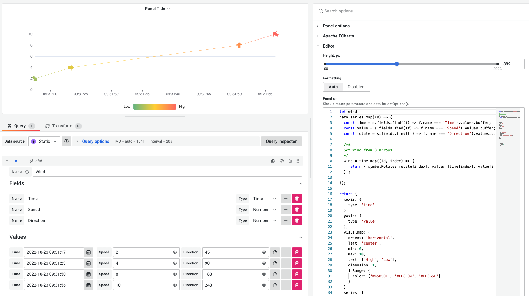
Wind Speed
The Wind Speed chart is one of many captivating uses of the Apache ECharts library.
- Each data element is displayed using a custom arrow.
- The speed is shown by the color of the arrow.
- The direction of the arrow indicates the direction of the wind.
A lot of insightful information is cleverly packed into a single visualization.
Directed Graph
Volkov Labs spent some time investigating the various options for visualizing directed graphs. The Apache ECharts easily met every single requirement we had in mind.
The following video highlights the capabilities of Apache ECharts for building directed and undirected graphs.
Tutorial
The launch of our Live Dashboard caused an avalanche of how-to requests from the Grafana community. We developed the following two-part tutorial explaining how we created this project.
In this project, we took advantage of a directed graph visualization to track company activities across Blog (Medium), GitHub, YouTube, and various external resources.
Live Dashboard
The Live Dashboard is now fully operational. The directed graphs are generated dynamically. We refresh the underlying data on a daily basis so that the visualization always provides the most recent information on our articles, releases, videos, and other activities.
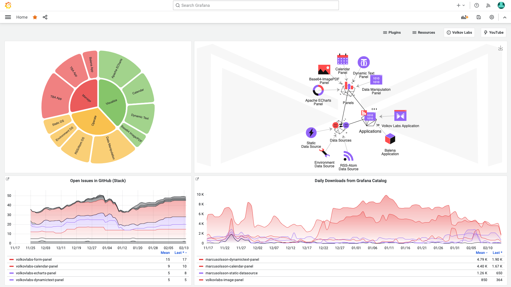
Directed graphs use the force layout to automatically alter the location of nodes. Furthermore, depending on their kind, nodes have varied icons and styles. By clicking the elements, you can view an external URL or zoom in on the subgraphs.
The preceding tutorial provides a comprehensive overview of the implemented functionality. You can see all of the releases we've made for each our project.
Business Charts panel in the wild
We have received a lot of encouraging feedback from the community since we adopted and upgraded Business Charts panel. Thank you very much!
Our clients gratefully welcomed our assistance in upgrading from an earlier version of the library.
Volkov Labs also switched industrial Plotly dashboards to Apache ECharts. We were able to preserve all existing functionality while also adding all of the required extra features, such as a custom toolbox button (to dynamically change the charts) and multiple Y-axis support.
We're Always Happy to Hear From You!
We value your feedback and are eager to connect with our community and partners. Whether you have a question, an idea, or an issue to report, here’s how you can reach out:
- Community Members: Have a question, want to suggest a new feature, or found a bug? We’d love to hear from you! Please create a GitHub issue to start the conversation.
- Enterprise Partners: Need assistance or have an urgent request? Open a Zendesk ticket for a prompt and dedicated response from our team.
- Join the Conversation: Stay updated and share your thoughts! Subscribe to our YouTube Channel and leave your comments—we can’t wait to hear what you think.
Your input helps us improve, so don’t hesitate to get in touch!