Grafana and the ultimate question of life, universe, and Customer Success

Picture, if you will, a vast and endless universe of subscription-based businesses, each one hurtling through the cosmos at breakneck speed, racing toward the ultimate goal of profitability. And at the heart of each of these businesses lies a burning question, a question that has the power to make or break their entire enterprise.
This question is none other than: "How much Annual Recurring Revenue (ARR) is at risk?"
Yes, it may not be the ultimate question of life, the universe, and everything, but it certainly feels like it when you're trying to keep your business afloat! For you, ARR is the precious lifeblood of any subscription-based business, and the risk of losing it is like a black hole that threatens to swallow everything on its path.
And presenting this information to executive management is no easy feat. After all, executives are often juggling a multitude of metrics, reports, and projections and may not have the time or patience for a lengthy discussion of renewal tracking.
Thereby, Customer Success must be strategic in their approach, presenting the data in a way that is clear, concise, and impactful. They must speak the language of the C-suite and be prepared to answer tough questions, such as “Where is the biggest amount of money at risk” and "What specific actions are we taking to mitigate risk?"
With these hefty considerations weighing heavily on my mind, I found myself scouring the galaxy for a solution to help me track and present this critical metric to executive management. Eventually, I found a powerful tool to gather, analyze, and present data clearly and concisely - Planhat.
What is Planhat?
Ah, Planhat! The ultimate one-stop shop for all things customer success management! With its suite of powerful tools and features, Planhat helps us manage our customer relationships, improve retention, and deliver exceptional experiences.
Alas, despite my initial excitement about Planhat's executive dashboard, it soon became apparent that it wasn't quite the solution I hoped for. While it has many valuable features and is a solid foundation for tracking customer success metrics, for power users like myself, there are some advanced BI features that are still missing.
And so, like a solitary spacecraft hurtling through the void of space, I searched high and low for a solution that could meet my needs. Thus, when I found myself searching for a better dashboard solution for Planhat, it was only natural that Grafana came to mind.
What is Grafana?
Ah, Grafana! It has been a faithful companion on many visualization projects throughout the years. From creating a platform to analyze performance metrics to building a dashboard to track support tickets to even forecasting the weather, Grafana has always been up to the task.
Its flexible and customizable nature has allowed me to craft unique dashboards and visualizations that met and exceeded my needs. And with its extensive library of plugins and integrations, I've seamlessly incorporated various data sources and platforms into my projects.
Connect Grafana to Planhat
With a heavy heart, I accepted that there was no data source for Planhat in Grafana. But being the intrepid adventurer that I am, I knew that there had to be a way. And so, I began my quest for a DIY (Do It Yourself) solution.
My first idea was to use the Postgres database as the intermediary. The universal SQL database promised excellent performance on my data set and the ability to do initial data transformations during SQL query executions. It even had the potential for an extension like TimeScale, in case I needed to expand its basic capabilities.
However, I soon realized that this was not a weekend project. I needed to create a synchronization mechanism between Planhat and the Postgres database, which would require either developing some code or spending time on integration with available 3rd party solutions, which is too much work for me.
But then, a glimmer of hope appeared. Planhat's extensive API provided a way out. It returned standard JSON output, and a helpful article JSON API Data sources in Grafana shed light on the differences between available JSON data sources and guided me towards Infinity Data Source, which had built-in authorization options, including mine - Bearer token.
Dashboard
With the hard part out of the way, the rest was super easy. I connected the Infinity data source to Planhat, executed queries, and displayed results in Grafana. And voila! I created a dashboard that showed me everything I longed for about my customer success metrics.
Take a look at my dashboard.
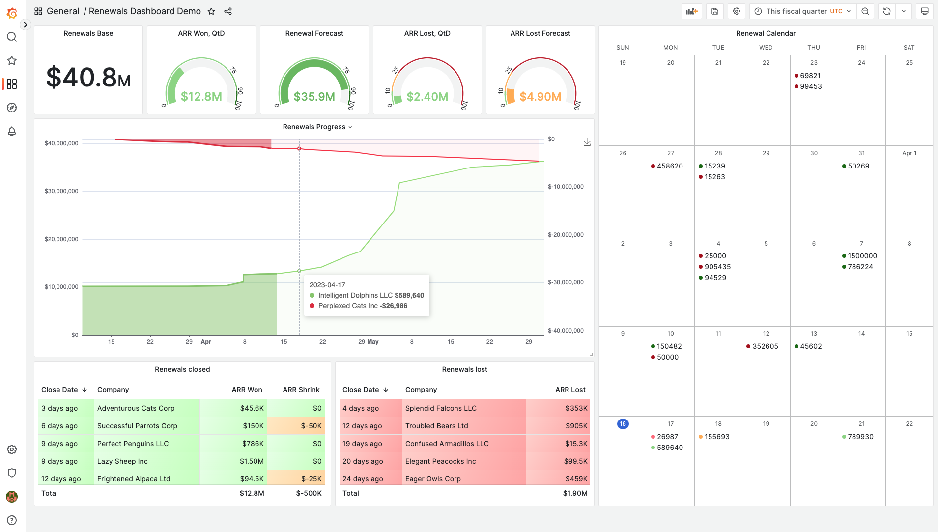
Below, I'd like to focus on each of the major panels explaining its functionality and implementation.
The primary data entity for each of the views is Planhat Opportunity.
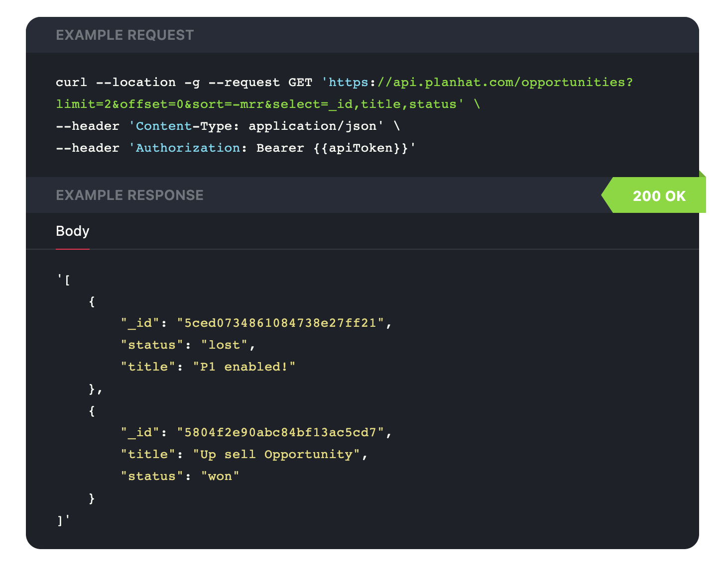
Besides basic properties, such as Company Name, ARR, Renewal Start Date, Close Date, etc. we calculate the probability of the renewal, which is the primary element of forecasting and will be presented below.
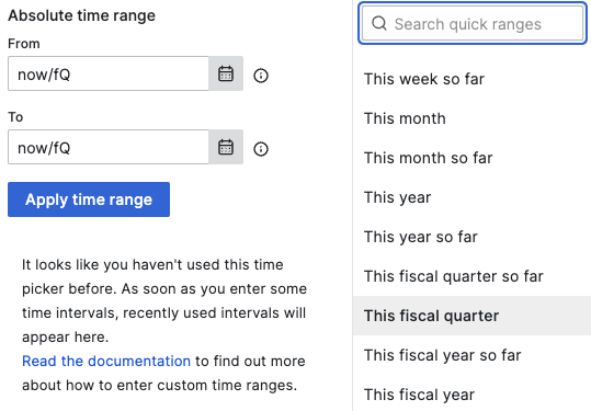
Time picker
But first - Grafana time picker. With just a few clicks, you can focus your visualization on exactly the period you're interested in (a feature missing in Planhat dashboards). But that's not all. The Grafana time picker also allows you to choose the Fiscal quarter and year as your time range (obviously, you can set up the beginning of the Fiscal Year for your organization)!
ARR Won and ARR Lost
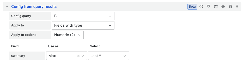
These panels just return the respective amount of ARR already successfully closed or lost since the beginning of the renewal period until now. I'd like to highlight: it uses the new Grafana transformation “Config from query results” to dynamically calculate target ARR to proper display thresholds on gauges.
ARR Won/Lost Forecast
These panels look very similar to gauges with already closed renewals, but there are two queries in the background of each of them:
- how much ARR is already closed
- how much ARR is forecasted to be closed or lost, correspondingly.
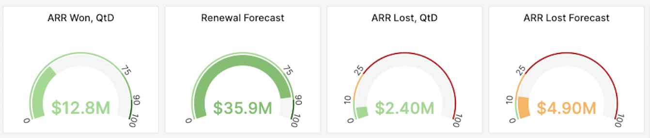
Two queries get merged in one data frame using Grafana “Merge” transformation, and they also dynamically set thresholds with “Config from query results”.
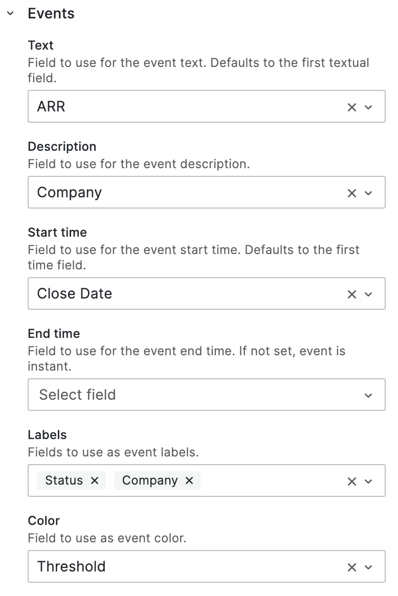
Renewal Calendar
It's not a build-in panel in Grafana, but a popular community plugin Business Calendar panel, so you will need to install it.
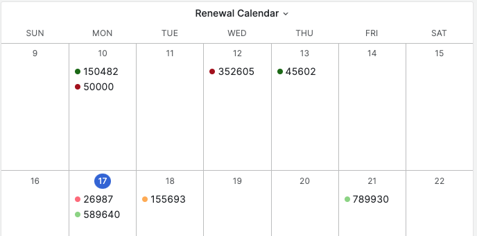
Out of the box, it supports text on the panel, a clickable popup window with descriptions and labels, and colors from thresholds. You just need to define proper field mapping in the plugin settings, the “Events” section.
Renewal Progress
Another community plugin, which also needs to be installed Business Charts.
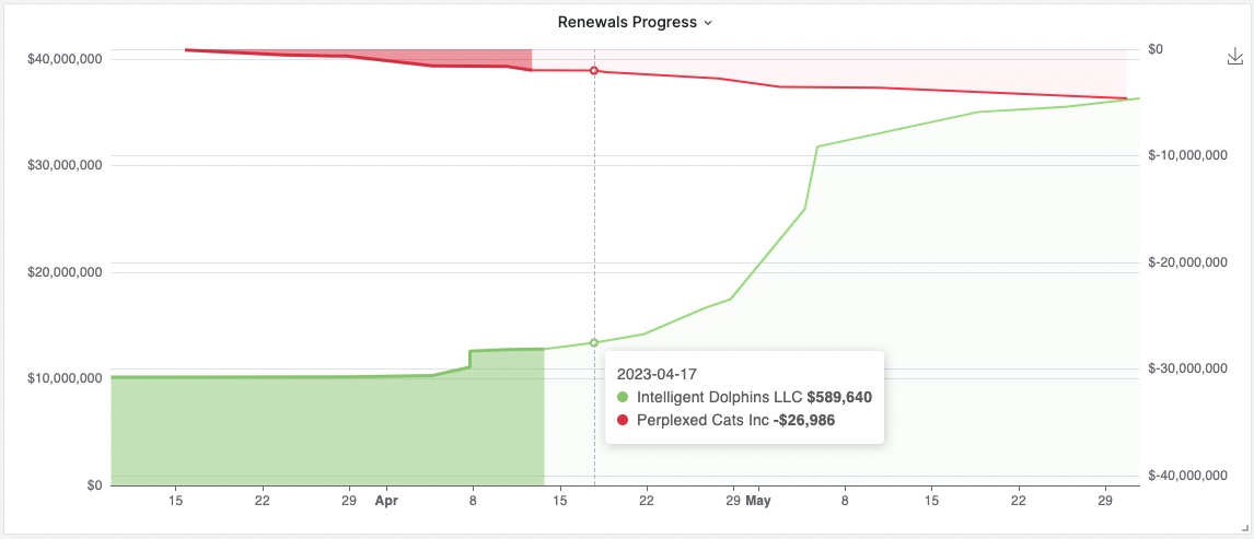
For those willing to take on the challenge, the Business Charts panel is a potent tool that can unlock a world of possibilities. It allows for virtually any data transformation and visualization options, making it the gem of the Renewal Dashboard.
However, unlike most Grafana panels, it's not plug-and-play. You need to write JavaScript code. This means it requires a certain level of mastery in JavaScript and an understanding of the Apache ECharts principles.
While there is an extensive demo available Business Charts Examples that covers hundreds of various scenarios, it doesn't necessarily cover every scenario.
In my case, I needed to get four time-series (renewal won, renewal lost, positive forecast, and negative forecast) and draw two lines (cumulative won renewal, including forecast, and cumulatively lost renewal, including forecast) out of them. I also needed to support custom fill and display a comprehensive tooltip.
Despite the steep learning curve, the Business Charts panel is well worth the effort. With its ability to implement the popular Apache EChart library in Grafana, the possibilities are truly endless. And for those who are up to the challenge, it can be a valuable addition to their visualization toolkit.