Thresholds
To support higher high and lower low ranges, we pointed the BI Alert Engine to the Thresholds color for reading the allowable range of data. The BI Engine uses the Thresholds colors as a guide in the creation of alert records and calls the assigned webhook.
The allowable range of data is a way to set what is normal, not requiring anyone's attention. No alerts/actions are needed when the data is within the allowable range.
In the illustration below, three alert records have been created due to the data being outside the allowable range three times.
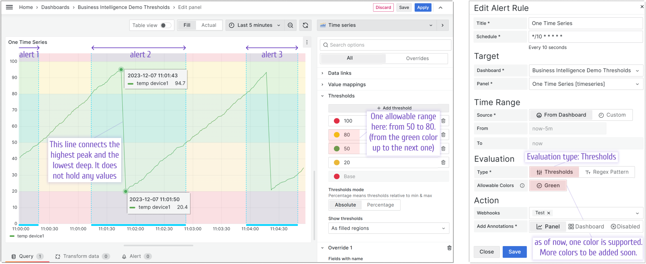
The alert records (annotations) are displayed on the graph as light blue highlighted areas. They highlight all time ranges when the data values (here, it is temperature) went outside the allowable range. In this example, the allowable range is from 50 to 80 (set in the Thresholds section).
Please note, that there are no values (no registered temperature data) between the highest peak and the lowest deep on the graph. The temperature changes abruptly from max to min.
- The temperature for alert 1 goes from below 40 to 50.
- The temperature for alert 2 goes from 80 to 94.7 (illustrated with a tooltip) and then from about 20.4 (illustrated with a tooltip) to 50.
- The temperature for alert 3 goes from 80 to about 93.4 and then from about 21.1 to about 33.7.
The temperature then continues still within the not allowable interval though it is not yet alerted since the alert rules run periodically. In this example, the last time, the alert rule was challenged was 11:04:50. After the next alert rule run, the interval for alert 3 will extend and a bigger area will be highlighted with light blue (not shown here).